Pages

Monday, 14 April 2014

Hunting the Lonely Little Smurf

Honestly, this is a science post.
The only advantage astrology has over astronomy is that astrologers come up with much better names for things. Whereas astrology gave us constellations with dramatic names like Scorpio and Cassiopeia, modern astronomy has to make do with things like the hugely uninspiring James Webb Space Telescope (who the blazes is James Webb ??), the Very Large Array, and - a masterpiece this one - the Very Large Telescope.

This total lack of imagination isn't confined to telescope-builders but pervades astronomy itself. You can't give galaxies cool names like "Andromeda" any more. Now you've got to call them things like J123402+114319, which is not only boring, but unpronounceable (you can still name asteroids though, which is done in a more-or-less sensible way). Actually this is a serious problem - it makes a lot of papers unreadable :

"Galaxy J123242+114319 is quite a lot brighter than J123354+111907, but not half as pretty as J160957+346709, which, if you remember, is itself far more interesting than J092149+521910."

So it should come as no surprise to learn of the existence of Blue Compact Dwarf galaxies, which I'm calling smurfs for obvious reasons. Smurfs are difficult to spot because they're small and not very bright. Also, unlike their fictional counterparts, they're tremendously boring to look at even if you're more than five years old.

Images from comicscenter.net and AGES VI.
Hunting smurfs if therefore a tedious and hugely unrewarding affair. It's not like you can cook them to brew a magic potion when you find them or anything. In fact, another disadvantage of not being astrologers is that astronomers aren't allowed to use magic, so Gargamel's incantations are forbidden by the Elders of Astronomy. Specifically, writing :

"We describe a sample of 207 Blue Compact Dwarf galaxies which we extracted from the Sloan Digital Sky Survey with the aid of a standard pentagram and chicken sacrifice..."

is precisely the kind of thing the peer-review process is supposed to weed out. Smurf hunting is just not nearly as exciting as you've been led to believe.

Sometimes, though, the smurfs just turn up unexpectedly. Like this one. Like most smurfs, it's not particularly bright, but it isn't particularly dim either. Which just goes to show that all of the automatic routines people have developed for looking at optical data still have room for improvement, particularly as this one was quietly minding its own business in the SDSS data for over two years, and even now doesn't have an SDSS catalogue number.
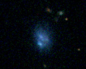
Here it is in the SDSS (aka Google Sky).
A stupendously patient student of mine, Hanna Herbst, found this one during the Arecibo summer undergraduate program back in 2011 (we'll get to why it took us so long to publish the data in a moment), looking at neutral hydrogen gas data. Which, I suppose, leaves two options for using this to impress people :
Option A : "I discovered a new galaxy !"
Option B : "I found a really gassy smurf !"
It turns out that smurfs are often very gassy, making them easier to spot by looking for their gas emission instead of normal optical light. That's something which didn't come up much in the cartoon, presumably because an evil wizard hunting a bunch of blue farting dwarfs is too stupid even for infants.

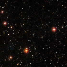
Anyway, as you can see, this galaxy isn't particularly visually stunning. Zoom out in the optical image and you'll see how extremely small and non-descript it really is.


Although it's more visible in the hydrogen data (see below), it still doesn't look like anything to write home about. In any case, the summer was short and there were other things to do, like swimming with sea turtles and publishing my thesis data. Moreover, there's a heck of a lot - and I mean a LOT - more interesting stuff in other parts of the same data set (that paper is submitted but still under review).

Hydrogen map of the smurf, covering an even larger area than the
optical image. The resolution of this image is much worse than the
optical, which is why the galaxy appears much bigger.
Worst of all, though - having spent a long time studying the Virgo Cluster - I utterly failed to recognize that the velocity of this galaxy (a rough proxy for distance) was extremely low : 363 km/s. In clusters, galaxies can be accelerated towards or away from us at speeds of thousands of km/s, which makes measuring their velocity almost useless for determining their distance. Since I was quite used to finding galaxies at these sorts of low velocities, it didn't seem tremendously important.

But this smurf is different. It isn't anywhere near a cluster, or anything else for that matter. It's lonely. Its low velocity can't be because other galaxies around it have accelerated it toward us, because there aren't any. So its low velocity must be because it's at a low distance.


It's so low that potentially it could be in our own Local Group of galaxies - which would be super-awesome. Cosmological models have massive problems predicting how many nearby galaxies we should see, generally coming up with about ten times more than we actually observe. Finding one so close would be very exciting indeed.

In fact, it almost certainly isn't. After correcting for the motions of known Local Group members, and estimating its distance by other methods, we found that it's more likely to be about 25 million light years away (the Local Group is about 3 million light years across). It could be a lot closer, but without a direct distance measurement (this is hard to do) we can't really say any more than that. Probably the most important thing about its discovery is that it was completely missed in the optical data for so long - there could easily be similar but closer galaxies still lurking there, waiting for someone with more sense than me to find them.

On the other hand, the fact that it's so lonely might be more interesting. In standard cosmological models, galaxies grow by merging with other galaxies. Dwarf galaxies are the building blocks of bigger, better galaxies. Just how many survive, especially the lonely isolated ones, is not well-known*. In fact a lot of people have problems with the whole idea of "hierarchical merging" - although we know it definitely happens, exactly how often and how important it is is matter of huge debate.
* Unfortunately there are no catalogues of isolated blue compact dwarf galaxies, which is a shame because that would be pretty much a smurf dating agency.

So our lonely little smurf turns out to be interesting after all, if not nearly as cool as space Nessie. The only question, then, is what to call it. I gave it the unassuming designation of AF7448_001 in the paper, which follows the IAU's boring naming conventions. It could have a popular name as well though. Herbst's Smurf is a bit of a mouthful. Hanna's Smurf is better, although we could really go to extremes and call it Hanna's Smurfoorwerp. Nah. Maybe there's a reason for those boring catalogue designations after all.

Friday, 11 April 2014

And Yet It Moves (but not like that)

UPDATE : Attention readers !  After reading this post, I strongly urge to also read this one ! The creator of the animation described here has made a new version, one that is ten million times better and has correct physics.


There's this annoying space GIF roaming the internet causing trouble. Perhaps you've seen it. No ? Well, here it is.


What it purports to show is the motion of the Solar System through space. But the accuracy of this has been utterly derided as an affront to scientific dignity. Which is a shame, because the video version is really quite nicely done, with good camera movement and a catchy soundtrack. The principle antagonist is notorious "Bad Astronomer" Phil Plait, who wrote a convincing and virulent attack on the video. I decided to investigate for myself.

Like many people, I was at first glance really quite impressed with the video, and didn't have any major objections to it. Obviously the orbits and size of the planets are not to scale (and I think their orbital speeds have be altered too), but that's just to make them visible. Fair enough. But then I read Phil Plait's analysis, and it seems that things are much, much worse than that. Says Plait :

"Sadhu shows the Sun leading the planets, ahead of them as it goes around the galaxy... This is not just misleading, it’s completely wrong. " 

He clarifies :

"Sometimes the planets really are ahead of the Sun as we orbit in the Milky Way, and sometimes trail behind it (depending on where they are in their orbit around the Sun)." [my italics]

The orbits of the major planets of the solar system all lie in a narrow plane (like being in economy class ! hahah.... sorry), which is tilted at about 60 degrees to the disc of stars that forms the Milky Way. Like this :


Credit : Science Minus Details.
We'll return to the tilt in a moment. But first, if the Sun was really leading the planets, then the thing is completely ludicrous (and this is quite a major part of Plait's argument). Yet I'm not so sure the viral gif does show the Sun leading the planets. Having read through the author's website, I can't find any evidence that he suggests this. In fact, some of other videos on his website clearly show that this isn't the case :


It seems to me that the appearance of the Sun leading the planets in the gif is just the result of a projection effect - i.e. that things can look different from different angles. On the other hand, Plait read the source material for Sadhu's model, so maybe there's something in there that's more explicit. I've glanced at it, but couldn't find anything stating this precisely. Actually I couldn't find a whole lot that was even vaguely coherent, but we'll return to this later. For now, just keep in mind that Sadhu is using an alternative model, even though that may not always be evident.


What the gif definitely does not show is the fact that the orbits of the planets are tilted at about 60 degrees to the direction of the Sun's motion. Says Plait :


"In the helical model, he shows the planets as orbiting around the Sun perpendicular to the motion of the Sun around the galaxy; "face-on", if you like.This is wrong. Because the orbits of the planets are tipped by 60°, not 90°, they can sometimes be ahead and sometimes behind the Sun. That right there, and all by itself, shows this helical depiction is incorrect."

There can be no mistaking that Sadhu's video shows the orbits with the wrong tilt. But is that so critical ? Well actually no, not really. Fact is that if you include the tilt, you still see the planets making a "spiral" pattern (technically it's a helix) as they move through space. The overall appearance just isn't that massively different compared to a 90 degree tilt.


So what's the big deal ? What does the author claim in this internet sensation that's so outrageous ? Well, not much. That particular video/gif are actually fairly inoffensive, to my mind. The most basic notion that the planets trace helical paths through space is perfectly correct. What honestly surprises me is that this is so incredibly popular on the internet. If you weren't aware that the Sun orbits the center of the galaxy - which, since the planets orbit it, necessitates that they trace out helical paths - then the education system has seriously failed. But do not despair ! This can be remedied very, very easily.


But we're not done yet. There's a sting in the tail, and it's a big one. The gif doesn't show it, but the video version ends with the worrying remarks that :

"Rotational motion and vortex motion are completely different things."*
"Life spirals." [picture of leaves]
"Life is vortex, not just rotation." [picture of developing ferns, then a flower, the Milky Way, the DNA double helix, etc.]
"The Solar System is part of life. Think about this while racing through space."

* Yes, they are. Plait notes : "They’re different in more than just name; they’re actually very different physical motions with different properties—you can get helical motion without the particles in it interacting, like in the solar system, but in a vortex the particles interact through drag and friction." Basically, claiming that the Solar System is a vortex is simply wrong. Sadhu appears not to have checked the word, "vortex" in a dictionary.

I could forgive even these rather hippyish sentiments, if they were no more than that. Alas, they're symptomatic of a much larger problem. Plait's merciless attack is full of sound and fury, but it's also signifying somethingReading more of the author's website, it turns out he is actively promoting quackery. It's on a par with the excellent Space Mirror Mystery* (the idea that everything further away than about 150 million km is just a reflection in a giant mirror), but less funny.
* I was delighted to find that this website is back online. Seriously, read it. It's epic.

From Sadhu's website :

"In this diagram it seems the Solar System travel to the left. When the Earth is also traveling[sic] to the left (for half a year) it must go faster than the Sun. Then in the second half of the year, it travels in a “relative opposite direction” so it must go slower than the Sun. Then, after completing one orbit, it must increase speed to overtake the Sun in half a year. And this would go for all the planets. Just like any point you draw on a frisbee will not have a constant speed, neither will any planet."

Apparently he thinks this is a problem. Worryingly, it suggests that he didn't show the 60 degree orbital tilt not for mere simplicity, but because he doesn't believe it's possible. Which - if true - is utter madness, pure and simple. There's absolutely no reason the planetary speeds have to be constant as they move around the galaxy - the massive gravitational pull of the Sun is keeping them firmly in its orbit, regardless of how those orbits are inclined.

"Secondly, most planets are visible throughout the entire year. In a “flat” model, every single planet would hide behind the Sun at least once a year. They don’t. Now the heliocentric model isn’t entirely flat, but mostly."

Fine. The heliocentric model isn't flat, which perfectly explains why planets aren't eclipsed by the Sun once per year. What need to state this ? Is he really saying that this is a problem in a heliocentric model ...? SERIOUSLY ?

"Fact of the matter is that if the helical model is correct and our Solar System is a traveling[sic] vortex, it will change how we feel about our journey. For me personally the heliocentric model feels like a useless marry[sic]-go-round: after one year we are back to square one. The helical model feels much more like progress, growth, a journey through space in which we never ever come back to our starting point. We are NOT in a big marry[sic]-go-round. We are on a journey."

Planets trace a helical path in space because our Solar System is orbiting the center of the galaxy. Big bloody deal. It's that simple. You don't need a wacky alternative model of the Solar System for this - it's happening anyway ! As for going on a journey though - well no, not really. Every other star is also orbiting the center of the galaxy, so no, we're not actually getting anywhere relative to other star systems.


Then there are some pointless ravings about the Mayan calendar.

He also links the following video. Skip to about 2 minutes in :


This has the bizarre quote that :

 "The planets do not come back on to their [own] path[s]. They don't. If they did, we most likely would have the same set of information over and over and over... like a broken record. And we'd probably get bored. It would be like Groundhog Year."

Then he links a video claiming that the Fibonacci sequence is the fingerprint of God.

None of which changes the fact that his first video/gif has only minor inaccuracies, but at this point I can't help feeling that this was more by luck than judgement.

Then there's his second video. This one is more objectively just plain wrong. He shows the Sun tracing out a corkscrew pattern as it orbits the galaxy, which makes no sense. The Sun simply goes around the center of the galaxy (and up and down a little bit) - nothing else. It's not orbiting anything else at the same time. For it to trace a helix is just nonsense. He seems to have an almost unique case of helix madness.


What of the source material - the alternative model Sadhu uses ? Garbage. Utter garbage. I find it difficult to read more than a sentence or two, because it's verging on incomprehensible. As in almost at the level of TimeCube.

"Three types of time may be recognized
- An absolute time that is universal and has neither a known starting point nor an end point; not even limited to a measurable parameter.
- For living organisms there is a time for birth and a moment for death. The interval is the life span. This time may be measured with parameters like seconds, minutes, days and so on. Mechanical devices may measure fractions and to some extant reliable. In every case some kind of energy source or gear system is involved.
- When one is engaged with some work involvement in another activity may be impossible or result to be unnatural. In such cases personal values decide what course to take up and say “no time” to the other work, however important that may be. This time is highly subjective."

Later :

"The constellations at the background are sufficient evidence to deny the heliocentric orbits for planets. The Sun at 500 light seconds distance, when visible within a cone of 30° maintaining a background of one constellation, say for example Aries, (Hamel at 68ly) the SOLSTICES and EQUINOXES through Zodiac Earth maintains in the opposite constellation at midnight, namely Libra. After six months to maintain heliocentric orbit, the mid day of today should become midnight and the midnight should become midday. This has not taken place!"

Well of course it hasn't - it's complete gibberish ! Plait may well be right that somewhere in this mess is a model wherein the Sun leads the planets, but I don't have the time or sheer mental fortitude to read the whole thing. I will note, though, that there's a paragraph where the author rubbishes the conventional explanation for the ozone hole - and God help us all if that goes viral. That, not petty disputes about whether the orbits of planets are tilted by 60 or 90 degrees, is why such quackery deserves to be shot down without mercy.


In conclusion then, the first video and gif of the Solar System as a "vortex" are not really all that bad. Unfortunately, the inaccuracies are not due to some minor over-simplifications, but are symptoms of a some very deep-seated misunderstandings. My feeling is that if your take-home message was only that the Solar System moves through space, and the planets trace out pretty spirally paths, then all is well and no harm done. But if it's leading you to question the heliocentric model, then we're all buggered.


EDIT : Epilogue
Although not directly related, a trailer was recently released for an entire glitzy-documentary called, "The Principle". This claims that not only is the heliocentric model of the Solar System wrong, but that geocentrism - the idea that the Earth is the center of the Solar System - is correct.

This is several steps worse than Sadhu's misguided ideas - it is wrong beyond wrong, on a par with Hollow Earth or Flat Earth gibberish. It appears that they have used stock footage of extremely famous, trusted scientists (Michio Kaku and Lawrence Krauss) and edited them into their documentary. Krauss categorically denies any wilful involvement, Kaku hasn't commented. Captain Kathryn Janeway, who was narrating the trailer, also vehemently denies supporting geocentrism, stating that she was misinformed about the work she was hired to do.

So, to the extremely small minority of readers who think this post was unnecessarily harsh, I say fuck no. Claiming that geocentism is correct is effectively stating that all of science is wrong. That is a lie - and that is not an opinion, it is a demonstrable fact. Such beliefs, if unchecked, threaten to return us to a time of superstition, ignorance and fear. I think we deserve better.

Everyone has the right to freedom of speech, so go ahead and believe in magical pixies and faith healing and crystals and turtles all the way down. That's fine, because by the same token, I've got the right to retaliate.

Wednesday, 2 April 2014

The Best Space Rock Ever

Sometimes life gives you lemons... and sometimes those lemons are fabulous. Today's lemon is the asteroid 1998QE2, the asteroid that just keeps on giving. For starters, it shares the name of the QE2 ocean liner, and happens to be of comparable size. As, of course, I already demonstrated, but here's a reminder.
Much more awesome video version here.
The asteroid shot to fame about a year back partly due to its name but mostly because it made a very close pass of Earth. That gave planetary researchers a chance to zap it with powerful radar beams, and lo! a moon was discovered. An adorable little moon, which, perfectly, is not a lot bigger than a real-life space station.

Larger version.
All this was known almost as soon as the data came in, when the asteroid shot past Earth at a distance of less than 4 million miles back in May 2013. After that, everyone quickly forgot about it, because it's no more a threat to civilization than the other QE2, or indeed, the other other QE2, and most people don't care about space rocks unless they're threatening to land on us.

Of course the other other QE2's threat factor may have been underestimated.
... that is, except for those plucky rock-zappers who now found themselves with a bunch of data to analyse. Through the magic of science and time travel*, the fruits of their labours can now be revealed. Probably the most awesome thing about radar observations (if you're trying to make graphics out of them) is that they can determine the true 3D shapes of the things they're measuring. Even better, I don't have to do that, because I'm a galaxy hunter, not a rock zapper.

*Well, we've travelled a year into the future. Compared to a year ago, I mean.

These are the shape models from the Arecibo radar observations (not to scale - QE2 is on the left and the moonlet is on the right), generously provided by Sondy (as, in fact, were most of the numbers in the rest of the post, which means I have someone to blame if anything's wrong). By sheer fluke, it turns out that 1998QE2 is pretty spherical, so my earlier renderings weren't complete nonsense.

What this lets us (and by us I mean Sondy) determine is a more accurate measure of the mass and density of 1998QE2 and its moon... which I'm going to call Prince Charles, for obvious reasons. Since one theory of binary asteroid formation involves the larger one spinning so fast it splits in two, thinking of QE2 as the parent may not be entirely inaccurate.

The formation mechanism of the other Prince Charles was rather
different, but no less terrifying.
First, here are the asteroids to scale and at their correct separation. The texture is, of course, entirely fictional :
The new measurements put QE2 at 3.2 km across, while Prince Charles is 800m in diameter - slightly larger than the initial estimates, but they're both still pretty puny. They're separated by 6.4 km, center to center - or perhaps more meaningfully, Charlie would be just 4.4 km (less than 3 miles) above the surface of QE2. It would span a whopping 10 degrees in the sky - this is massive. The Moon spans just 0.5 degrees of the sky from the surface of the Earth.

Left : Earth's moon, seen from the Earth. Right : Prince Charles seen from 1998QE2.
The real fun, though, comes from the mass. Previously I stated that the mass of the QE2 was equivalent to about 300,000 cruise ships. That has to be lowered a bit to about 225,000 ships. This matters. For starters, the escape velocity of QE2 is about 1 m/s. Which means you could jump off it - easily. Thanks to the moon, this means you could jump from one world to another. Anyone growing up in this crazy environment would learn orbital mechanics at the same time they were learning to walk, though walking would be nearly impossible. Surface gravity would be less than 0.003% of Earth - drop a ball on 1998QE2 and it would take about 90 seconds to hit the floor.

But the most fun implication from the mass is the density - 0.7 kg per cubic meter. That's less than water. And that means this asteroid, with the same name as a large famous ship, would float. I love this rock.

And yes, those are QE2-sized ocean liners.
Except that it wouldn't - not like that. That's the naive, dramatic version. Since the density of the asteroid is only about 70% that of water, 70% of its volume would be underwater. Instead of a mile-high cliff sticking out of the water, what would actually be visible would be more like a small, low island.

Of course the water transparency wouldn't be anything like this - it would be, at best, twenty times less than this.
Sadly though, even this isn't accurate. The asteroid is made of rock, not ice, so to have such a low density it's probably a rubble pile - a loose collection of rocks and gravel, with lots of empty spaces. Instead of bobbing about in the ocean, it would collapse in a huge unsightly heap,a bit like unleashing a truly ginagorous ("titanic", you might say) bath bomb. Enclosing it in a giant plastic bag might work, but it would still collapse and at best, what you'd get would look like a monstrous jellyfish.

So here we have a world with the same name as a famous ship, of such low density that it would float (though only for a little while before disintegrating), and which is so small you could jump off of it and land on its moon - which could legitimately be confused with a space station. If there's a more awesome asteroid, I'd very much like to hear about it.