Today's post will be an unusual mixture of home décor, medieval navigation, and extragalactic data visualisation. Which sadly does not mean involving any interior designer astro-pirates, although it obviously should.
Hypothesis : there is no blog post that cannot be improved by the addition of interior designer astro-pirates.
Anyway, since the start of the year I've been indulging in some retail therapy. My home office where I've been working for most of the last two years is a 3x3m space consisting entirely of bog-standard IKEA furniture. You know, stuff like this :
I mean, it works. It's definitely a table. You can tell because you can put stuff on it and they stay cleverly well above the ground at an easily accessible height. It's not even ugly, but it's certainly minimalist... and that's just not my aesthetic at all.
After two years of various levels of lockdown (and a great deal longer in terms of living independently) I decided that I needed to do something about this. These days I have enough disposable income that I can indulge myself and there's just no need to go for the basic-but-boring stuff any more. The latest and hopefully final lockdown really pushed me into going slightly Grand Designs, even though I think such programs are only one step above Big Brother or Love Island in terms of sheer mindless inanity.
My preferred aesthetic is an 18/19th century drawing room. The sort of place the First Sea Lord of the Admiralty would gather his underlings to discuss an expedition to the Northwest Passage, all while sipping a big glass of brandy. Something like this :
Or perhaps this :
Or this :
I want it to look rich and dark. I want it to be cosy. I want it to be ornate. I want gleaming brass instruments that look functional but don't actually do anything useful. I want everything to have unnecessary detail. And - and this is the important bit - I want the walls to be covered in maps. Basically, I want the exact opposite of the IKEA design philosophy.
Of course this project suffers from a few teeny-weeny limitations :
- I have a 3x3m space to work with
- I'll need to transport most of my stuff at some point when we eventually get a permanent* home
- I'm not a millionaire.
* Whoever decided to coin the term "forever home" was a linguistically deplorable moron.
Still, there's a lot that can be done within those restrictions. And now I'm going to annoy the heck out of y'all but not having taken a picture before I got started...
Initially I had nothing on the walls at all, which I really do not like. So finally I got around to hanging a couple of old maps, one of Prague (I got it free in a shop years ago) and one of the world (I had a much bigger version back in Puerto Rico but was unable to transport it, and to my annoyance posters are a lot more expensive here for some reason).
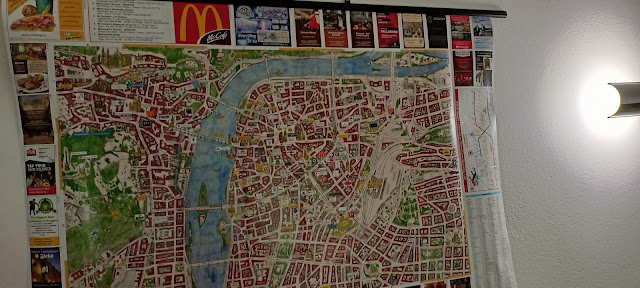 |
Not at all easy to photograph because of the lighting and room size. They look a lot nicer in reality.
|
These are okay, but as things progressed I began to find them inadequate. So now they're relegated to the mezzanine area*, where they're doing a decent job of making the walls look better than if they were blank.
* We actually have a large and very comfortable flat, but it doesn't really make ideal use of the space - hence my tiny office room.
All maps are hung with plastic
poster hangers, which are a great alternative to traditional frames - those are vastly more expensive, non-transportable, and size-restricted. I'd have preferred something more wooden, but finding the right size is tricky. I should add a fourth constraint that everything for this project needs to be available in or ships affordably to the Czech Republic, which can be surprisingly difficult.
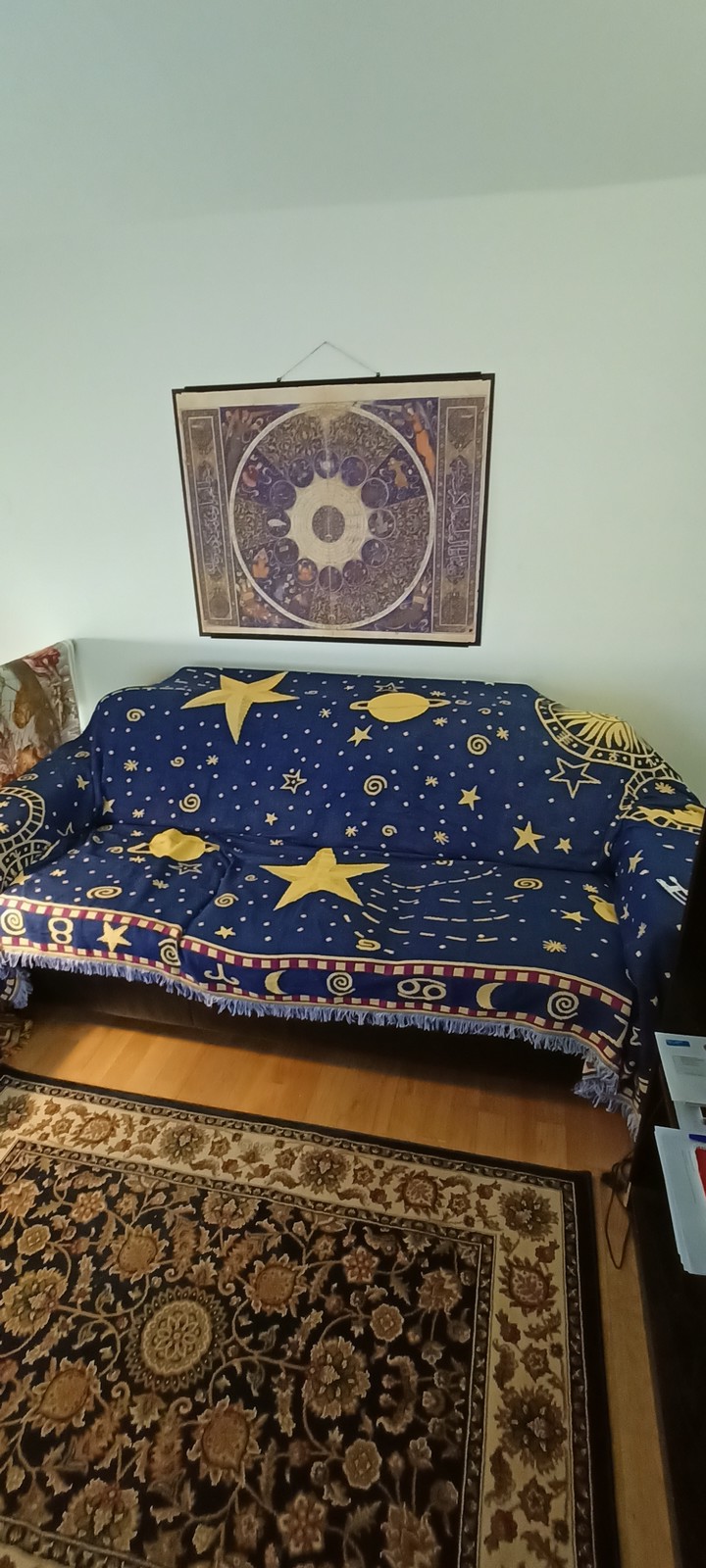
After this prelude, the first real task was the sofa. This came with the flat and is fine in itself, but the cheap red IKEA throw I bought years ago now seemed less of a pleasantly inexpensive addition and more of a horribly garish detraction. What am I, a bullfighter ? I wanted something more astronomical, so after a good deal of searching I eventually found
this one. I was willing to spend quite a bit more than for the bog-standard stuff, but something in me rebels very strongly against a throw costing much more than about £50*, so finding one that also reached the necessary size took some considerable searching.
* As a rule, I'm against expensive fabrics. I mean, it's a piece of cloth, for heaven's sake. It doesn't do anything except sit there waiting to be stolen by astro-pirates.
Next (I think - the order might not be correct) came a globe - surely an essential part of any map room. I was quite tempted by a more fancy version, but in the end I settled on a very cheap brass/gold-effect
model with an overall aesthetic that I like very much. It's amusingly inaccurate, claiming that Puerto Rico is part of the UK for some reason (it isn't and never was; our attempt at invasion resulted in 10,000 soldiers getting dysentery). It's also a bit wonky and the grid lines don't match up, but I like it very much anyway. It just looks nice, which is all I need it to do.
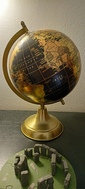 |
| The miniature Stonehenge, oddly, sort of works. |
I believe the next step was the rug. Again much searching in order to find one of the right design and size. While I hadn't initially planned on this blue and gold colour scheme, it was very important that everything be self-consistent. No longer would I tolerate a higgledy-piggledy mixture of styles, because the First Sea Lord of the Admiralty certainly wouldn't put up with such shenanigans. So I found
this one, which I am thoroughly satisfied with.
Now we're getting somewhere. Next, I think, came more accessories. In my protracted searching I came across armillary spheres, which you often see large versions in country gardens. This led me to the wonderful
Etsy site, which is a great place for inspiration if nothing else. It's got tonnes of armillary spheres and similar products, but suffers from not all stores taking ordinary payment methods - some only do Pay Pal, which is extremely irritating. Eventually I found one for an acceptable price on ordinary old Amazon.

The armillary sphere is a
simple way of tracking the positions of the stars throughout the year. The elaborate brass construction is exactly what I'm going for, although the size was disappointing. I spent a long time searching for an affordable option which would closely match the globe in size, so they'd pair nicely as earth and sky. But this one is considerably smaller than advertised. Later, as you can see, I purchased a second, more expensive model, but to my great irritation this was exactly the same size. I left a negative review of the seller on Amazon and used them as a flanking pair to the globe instead. Not exactly what I wanted, but it does the job. Plus I get to make endless jokes about how my big brass balls are too small, so there's that.
Probably at this point I started replacing the maps. I wanted a more genuinely ancient appearance than the accurate vintage style poster I already had. At this point
Redbubble entered my sphere of consciousness, and it must be said that this is a truly excellent - if somewhat expensive - site. Their choice of maps is
vast, and you can get all the designs printed on a veritable plethora of different products.
But in the end, finding posters of the right size, design and cost proved too difficult. Rebubble's main annoying limitation is you can't customise the size of the posters. I circumvented this by doing custom poster printing directly through a
local service. This is rather cheaper than Redbubble for posters of the same size, and the print quality is excellent. Their "advertising posters" are apparently meant to be viewed from a large distance but honestly you could jam them in your eye and the resolution would still look great, apart from all the blood getting in the way. Plus them come on matte paper which looks an awful lot better than glossy photo prints. They get very unfairly low reviews on Google Maps - every time
I used them, the service was excellent.
Anyway, after much searching I found two publicly available high-resolution scans of historical maps. One of these came about because I remembered a gorgeous image in a book I have :
The Sky Atlas by Edward Brooke-Hitching. If you like maps and space, then this is the book for you. My favourite image was the
horoscope of Iskandar Sultan,
grandson of the should-be-much-more-notorious Tamerlane. Showing the planetary alignment at the time of his birth, it's a fabulously intricate and opulent piece of work, and looks great as a printed poster. It also matches perfectly with the colour scheme of the rug and throw.
Next a more conventional map for the opposing wall behind my monitor. For this I found a
1630 Dutch map which was the first to be published in an atlas and one of the first to show Australia. I chose it entirely based on the design and colour scheme.
It's interesting to see the evolution of styles in maps through the centuries. Medieval maps tend to be elaborate cartoons. Renaissance and Enlightenment era works are more informative but still gloriously rich works of art. Later pieces tend to reduce the purely decorative elements to a minimum, while the modern versions usually strive for accuracy above all else and use only the data itself to create anything you could call "art". Personally, it's the 17th-18th century styles I find most appealing, though I do like the later Victorian designs as well.
I think at about this point it became necessary to do something about the IKEA tables. I considered replacing them, but the design I want is usually very
expensive and they'd be difficult to transport when we eventually move. I did add two small sets of
bamboo drawers, which look nice enough and hold enough stuff to significantly reduce clutter, but for some reason a small set of darker drawers with brass handles proved nigh-on impossible to find.
For the tables, Shirley had the bright idea to use
contact paper. This is much cheaper than getting a replacement and the results do look very convincing. Applying it is quite some hours of work for even a small table, however - it's quite a fiddly process, and at all stages you have to continually smooth out air bubbles. The final results are not perfect, but they are more than adequate for my needs. You really can't see the defects unless you go looking for them.
We're almost at the end of the "look at all the lovely things I bought, aren't I a good capitalist" section. The penultimate step was to have some ornamentation for the side table. What I really wanted was a vintage style
constellation globe, but for some reason affordable replicas of these just don't exist. The armillary sphere looked nice for a while, but when the big brass lamp I ordered eventually arrived, it just looked a bit sad and lonely, and I was in no mood for a third attempt at getting one of the correct size.
There are three main items on my wish list for my ideal permanent office. One is a
brass astrolabe. Another is a drinks globe. The third is a working brass orrery. All of these are just too expensive, but my searching had revealed many wooden alternatives. I settled on
this tellurion, which is a type of orrery limited to the Sun, Earth and Moon. This sounds simply but actually to ensure accurate rotation periods the gearing system is quite complex, and this intricate appearance is something I'm very keen on. There are a number of versions of this available but this particular model sold itself by the size, design, and the fact that it's a Ukrainian company. How could
I say no to that ?

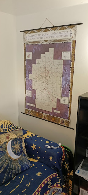
Finally, the old red cushions on the sofa were now looking just plain silly in contrast to the dark blue throw, and the galaxy conference towel and Welsh flag draped over the side rail (my office is on the mezzanine above the bedroom) just didn't just it. So for the finishing touches, the most expensive part of the process took me back to Redbubble. For this I ordered four cushion covers and two "tapestries". The cushions consist of two medieval world maps and two Sun/star mandala designs. The wall hangings are archaic maps of the northern and southern sky hemispheres, showing the constellations as mythical figures.
Et voila, my miniature map room is almost complete.
But not quite. With most other blank space now full of colour and pattern, the wall space next to the bookshelf (which you can't really see here) began to look increasingly empty and in need of filling. For this I decided I needed to really make the space feel like my own by making my own poster from scratch.
As the area of the sky I've spent far the most time investigating, I chose the Virgo galaxy cluster. You may have seen some of my
efforts on this
before, but for this I needed something different. I needed a map that prioritised atheistic over information content, filled with purely decorative elements and prepared to sacrifice - if necessary - accuracy*. At the same time, I felt as much information as possible should be preserved and I would far rather simply omit information rather than doing anything as perverted as
altering any.
* In the old-style depictions of modern information, I was heavily inspired by Eleanor Lutz, although her stuff definitely doesn't compromise on accuracy.
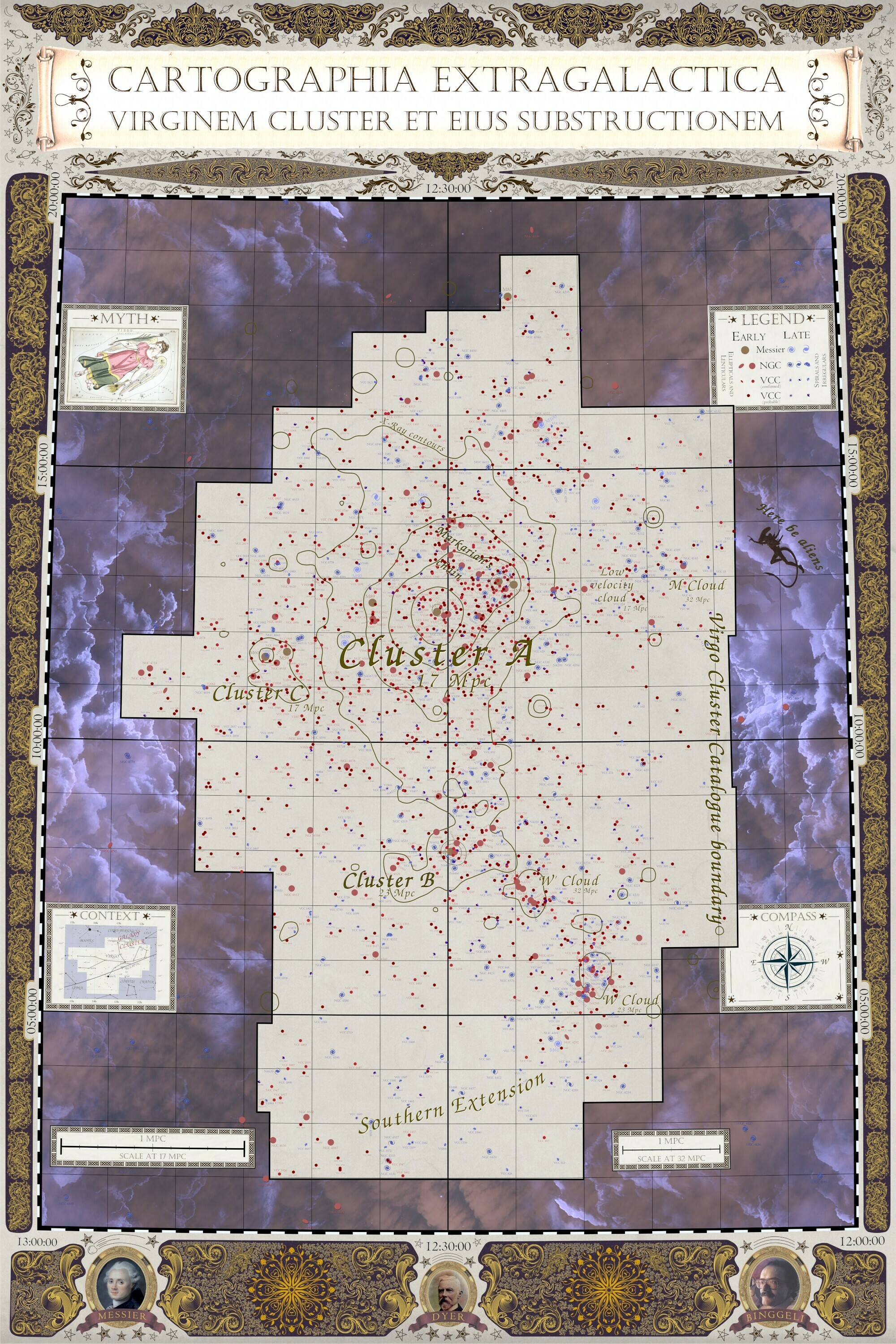
This is what I came up with - my attempt at how the Virgo Cluster would have been depicted in the 18th century :
 |
| A clearer view of the image itself can been seen here. Fun to do as a one-off but it would be hell if regular publication figures were expected to conform to this sort of styling... |
I made it using a customised version of my data visualisation tool
FRELLED, which I spent a lot of lockdown time recoding. Making this map actually helped me to finally realise that sky axes on scales this large need to be curved, though this still needs to be properly implemented into the main code. I customised FRELLED so I could import each component on separate layers, which was essential when combining and managing so many different elements.
The map shows pretty much all the known galaxies in the
Virgo Cluster Catalogue, except for a few which had to be hidden by the text. Major structures within the cluster are labelled, following
Boselli et al. 2014. I deliberately avoided drawing boundaries between the different structures, however, because it really isn't possible to define these very precisely. I also added X-ray contours from the ROSAT X-ray satellite (a file I was fortunate to have from many years back, as this is very difficult to find), which is a crucial component of the cluster as it's widely believed to have a dominating influence on galaxy evolution. And then around the sides we have the Virgo figure herself, a key explaining the different galaxies plotted, the location of the cluster in the larger constellation, and scales to indicate the size at the different distances of cluster sub-structures. I kept this in the conventional unit of Mpc, not light years, because this is a map for
me and not for public outreach. Note also the compass indicates that east and west are reversed, as is astronomical convention.
There was nothing particularly complicated about making the map - it was largely just a matter of iterations. By far the most time-consuming part of this was labelling all the galaxies. There are several thousand of the little buggers, and as new components were added, these labels had to be moved and resized several times. This part wasn't fun, but it's very satisfying that just about every galaxy label is visible and legible.
For the rest, I thought about adding stuff about the dark hydrogen clouds I study, but I decided this would be too technical*. Similarly, I could have added boundaries of other surveys besides the VCC, or added different selections of the galaxies from multi-wavelength catalogues. This too would have resulted in an overly-complicated appearance. I kept it simple : optically selected galaxies from the three major catalogues of the area**, with the figures of the major observes shown in little portraits : Charles Messier (who catalogued fuzzy blobs for the explicit purpose of not being confused with comets, note the decoration above his frame), John Dyer (who compiled the New General Catalogue, though I think there's a typo and he should actually be Dreyer), and Bruno Bingelli (who produced the indispensable Virgo Cluster Catalogue, a true bible for Virgo studies).
* Someday I would love to have a true atlas of the cluster, showing the distribution of different structures - different galaxy types, redshifts, wavelengths, in all the various parts of the cluster. A man can dream...
* Which range in time from the 18th century to the present day. This means that giving the galaxies symbols which are sized based on which catalogue they were first recorded in is a reasonable proxy for their true size and brightness, since the earliest catalogues could only detect the biggest, brightest galaxies.
As to the purely decorative elements, most of these are, ummm, acquired from the internet. This being a case of something which is only ever going on my wall, I didn't pay much attention to where I got the clipart from (hence this one will never be made available at full resolution, let alone for sale). My major contribution to this was the swirly pattern found within parts of the purple bordering, especially around the portraits - this is so intricate that even on the final gigantic 12k x 8k resolution print, the finest details are unresolved. Which was probably overkill but never mind.
So that's the saga of my mini map room. It's basically complete now, except for the need to apply contact paper to the big black bookshelf and some minor odds and ends. It may not be my dream study, but it's a heck of a lot closer than the the IKEA standard I had before. And all for less than the price of an Oculus Quest - not a bad spring project, and it finally got me doing artwork again. Hooray !


_balanced.jpg)


