
Do you know what my ever-so-lovely girlfriend said to me the other day ?
She said I'd make a terrible detective.
Well !
"Scientists are like detectives" is practically outreach 101. It's standard practise for explaining science to children. So such a claim is so outlandish as to require a weeks' answer or none, so I settled on an intended look of blank bafflement which I'm afraid probably ended up as more of a scowl.
But it gets worse. Apparently I was failing to only adjust one variable at once.

I mean, really ! There's several tens of thousands of lines of meticulously debugged Python code that will attest otherwise.
But describing the process of debugging code is about as exciting as watching the George Clooney version of Solaris in slow motion. Let me instead give a much more fun example of science-as-detectoring with a figure in my latest paper. This is a not a brand new plot, but a very famous discovery to which I've added my own meagre data. I'll cover the science of my own work in a the next post - in this one I want to look more at the background and the major aspects of what it shows.
This infamous Tully-Fisher relation is deceptively simple : a nice straight line plotting how one variable affects one other. At it simplest, it says that bigger galaxies spin faster, which is just about one of the most boring things you can say about them. Hundreds of billions of stars, uncounted planets, supernovae, great hulking black holes at their heart, the not-quite-infinite majesty of the darkened cosmos... nope, today, "big ones are more spinny".
Really, this is what we're going with ? Oh. Okay.
Start to look a little closer though, and the Tully-Fisher relation blossoms into a bewildering array of complexity and ugly truths. This is a good opportunity to examine just how messy the coalface of research can really be, and a reminder that while science certainly does depend very strongly on rigorous, objective facts, it has no small component of subjective choice behind it too. It's also a good example of how much frickin' work goes into a single bloody plot.
 |
| Surely the term "data mining" must have originated in Wales. |
This is for once an intentionally long post. If, though, you're already familiar with the Tully-Fisher relation, or don't really care about it very much, feel free to scroll ahead to section four.
1) The Tully-Fisher Relation And How To Measure It
Here's the plot. For an astronomy post I'm afraid this one is going to need quite a lot of graphs and precious few pretty pictures of galaxies.
 |
| Simplified by a just a smidgen. |
This is the original version from a famous 1977 paper by Brent Tully and James Fisher. What it shows is how bright a galaxy is (vertical axis) as a function of how fast it's rotating (horizontal axis). Regular readers will know I've shown versions of it before because although the basics are simple, the devil is in the details - and the devil is a jolly interesting chap if nothing else.
Let's look at the basics first though. We'll get to exorcising demons examining the details later. First, here's how we get the data.
Measuring the brightness
In this original plot the vertical axis is how bright the galaxies are at ordinary optical wavelengths. Astronomers use a horrible thing called the magnitude system, which expresses brightness in some convenient but monstrously unintuitive and literally arse-backwards way*. The simplest version is apparent magnitude, which just means how bright things appear in the raw observations from the sky.
* The brighter something is, the more negative its magnitude. I mean, come on.
 |
A nice chart I found here. The Andromeda Galaxy is about +3.4. |
Problem is, this tells you little or nothing about the physics of what you're looking at. For that, as in the Tully-Fisher plot, you have to convert to absolute magnitude. This is what the apparent magnitude would be if you were a fixed distance (10 parsecs, about 33 light years) from the source. Keeping everything at the same distance means you can make fair comparisons. For the enthusiasts, absolute magnitudes for galaxies typically range from about -20 (very bright) to -10 (very faint), but these aren't strict limits at all.
The conversion from apparent to absolute magnitude is easy as long as you know the distance. Admittedly, getting this can be extremely difficult, depending on how accurate you need to be. But let's tackle the other variable in the plot first.
Measuring the rotation
Finding out how fast galaxies are spinning is a bit more complicated because there are several different ways to measure this. The most obvious is to simply sit back and watch the stars move across the sky (their "proper motions"*). But that's only really possible in our own and the very nearest galaxies. And to determine their full 3D motion, we need to measure their speed towards or away from us - that is, along our line of sight.
* I have no idea where this term comes from. A Google search for "improper motion" returns results about everything from flawed legal practises to unpleasant bowel movements.
That turns out to be much easier : we can measure the redshift of stars surprisingly easily, even at very large distances indeed. And this has some key advantages. Here's a simple model of a galaxy showing how things rotate relative to an observer. If we're viewing it face-on :
 |
| With a reasonably realistic rotation pattern but a very simplistic distribution of stars. |

In the middle, all of the movement is across the screen, with nothing moving towards or away from us. But at the sides, all the motion is towards or away from us. Here, measuring motion across the sky would be very tough, but redshifts become easy, and then give us the rotation velocity directly. For galaxies to have stable rotation and not be tearing themselves to bits, the rotation speed at their edges must be the same as everywhere else.

Well... it's not quite that simple, unfortunately. If we happen to see a galaxy which is exactly edge-on, then the stars right at the edges will indeed tell us exactly how fast they're rotating, directly - with no need for any further corrections at all.
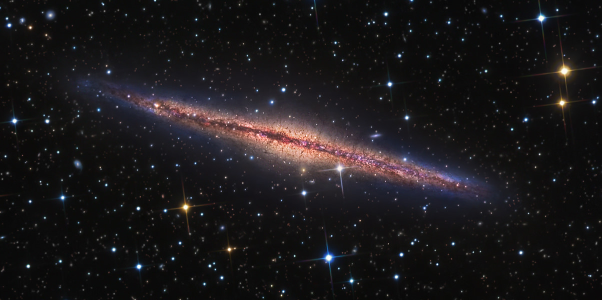 |
| Like NGC 891, for example. |
Of course most galaxies don't happen to line up with us like that otherwise we'd have to seriously consider Intelligent Design as a legitimate theory, assuming that the whole point of the Universe was so that human beings could do really good extragalactic astronomy*. Most galaxies are somewhere in between face-on and edge-on. But, provided they're not too close to the former**, and we assume they're basically circular in shape, it's easy enough to correct for this.
* Not that we need Intelligent Design to assume that, of course. It goes without saying the astronomers are obviously the highest form of life.
** The errors in this are pretty large : a galaxy has to be more than around 30 degrees or so inclined away from us for this correction to work, otherwise the correction becomes so great that small measurement errors lead to big problems.
A second problem is that actually, using starlight is not a good idea. Stars are usually embedded in much larger gaseous discs, which we observe with radio telescopes. Using those measurements, we find that the stars don't probe the full extent of this rotation curve : that is, they'll underestimate how fast the galaxy is truly rotating.

This is one of the main pieces of evidence for dark matter. Without extra, unseen mass to hold it all together, most galaxies are rotating so fast they ought to quickly fly apart.
Now to get a nice rotation curve like that one isn't easy. You need to have observations of the gas of very high resolution, so you can see exactly which bit is moving at which velocity, and that's technically difficult to do. What's much easier, however, is to get an observation which integrates all the gas in the galaxy at once. What you see in such data is a bunch of blobs : you can't see any structure to them at all, all your spatial information is blurred out - but you can still see the velocity range over which they're detected. You can plot this very easily as a spectrum, which shows how bright the gas is (or rather, how much there is) as a function of velocity :

By measuring where the real emission begins and ends, we get a line width. Where exactly you choose to make the measurement is a bit tricky, but the usual convention is to measure it at either 50% or 20% of the peak brightness (flux) level : the W50 or W20 parameters. Generally these are similar, though not always. In combination with the inclination which we estimate from the optical data, we can correct it to get a estimate of the true rotation speed.
So this is pretty complicated already. Brightness is okay, but rotation is quite tricky.
BUT, we do have some cases where we can get those nice rotation curves, so we can compare the line width measurements with these... and it works well. It's certainly not ideal, but it does work.
Measuring the distance
But wait ! Remember, we can't estimate the intrinsic brightness without knowing how far away the galaxies are. Now Tully & Fisher had a sample of galaxies for which they did have decent distance measurements (there are various ways to estimate this). What they found was that this relation between rotation speed and brightness is so good, you can use it as another way to estimate distance.
That is, you can very easily measure the apparent magnitude of a galaxy, and quite easily determine its line width. With these two measurements, assuming the Tully-Fisher relation holds, it's then easy enough to work out the galaxy's distance for its absolute magnitude to match the prediction.
I'll spare you the details of measuring distances except to note Hubble's famous law : the faster a galaxy is moving away from us (which is another thing that's easy to measure), the further away it is. This law isn't perfect, galaxies can have "peculiar motions" which deviate from the large-scale flow. But it's pretty darn good. So on very large scales, in most cases we can get a reliable distance estimate very easily. And that lets use use the TFR in a completely different and much more interesting way than as a glorified tape measure.
2) The Baryonic Tully-Fisher Relation
It might help to take stock of how complicated this relation has already become. To measure rotation speed we need to get the line width and also inclination, which means combining data from very different wavelengths. We can't do this viewing-angle correction at all unless galaxies are more inclined than about 30 degrees, otherwise the errors are too large. And using the line width is never quite as good as measuring a proper rotation curve.
In contrast, measuring the brightness is quite a lot easier. Or at least, it was, until Stacy McGaugh came along and made everything more complicated.
 |
| They're darned ugly plots, I know, but don't blame me ! |
McGaugh found a sample of galaxies that stubbornly refused to obey the standard TFR (green points on the left). There didn't seem to be anything wrong with the measurements, they just rebelliously failed to follow the trend. But when he changed the vertical axis from brightness to mass, everything changed. On the right, the green points now happily agreed with all the others : a nice neat line reappeared !
McGaugh called this the baryonic Tully-Fisher Relation. "Baryonic" being just a fancy word for "normal matter", the stars and gas we're all familiar with - as opposed to the more exotic "dark matter", which remains mysterious.
Why does this work ? In bright galaxies, their baryonic mass is dominated by stars. So using either stellar mass or brightness will give the same result, and adding in the gas doesn't do anything. But in faint galaxies it's the opposite. Their baryonic mass is dominated by gas, so you have to use the gas mass for those and you can ignore the horrible stars.
What's interesting is this reveals the original Tully-Fisher relation was just one particular form of a more fundamental relation. Replacing brightness with mass puts it on a much more physical footing : brightness depends on what wavelength you're using, but mass is mass. And notice how vast the mass range here is, from ten million to a hundred billion times the mass of the Sun. This relationship holds across four orders of magnitude - a factor of ten thousand. Clearly something important is going on.
In practical terms, measuring the mass of the gas turns out to be relatively easy. While converting the optical brightness to stellar mass is not at all trivial, it does seem to work. But before we get to the glorious nitty-gritty of all this, let's take a step back, assume the relation is basically right, and think about what it actually means.
3 Why Does It Do This ?
 |
| Sorry Homer, but worse is to come. |
At a naïve, hand-waving level, this relation makes sense. A more massive galaxy has to spin faster to be stable against gravitational collapse. And though galaxies are mass-dominated by their dark matter, the more dark matter they have, the more gas they can accumulate and the more stars they can form. So it's not at all surprising to find that the faster-spinning galaxies (that is, the most massive objects) have the most gas and stars.
As I said at the start, big things spin faster. Whoop-dee-bloody-doo, another marvellous scientific breakthrough. Your tax dollars* at work.
* Actually, Czech crowns. But you get the idea.
But... what should the exact relation be ? Should it be the same for all galaxies ? What about those that don't have any gas at all ? What about those which are interacting with other galaxies ?
This is where it gets complicated, and sometimes extremely puzzling. First, in clusters galaxies are prone to losing large amounts of gas through a process that doesn't much affect their stars. When enough of their gas is removed, what remains is the most tightly-held stuff in the very centre, which doesn't probe the full rotation curve. So these highly gas-deficient galaxies don't follow the BTFR, but this is most likely just because we're not able to measure their rotation correctly : intrinsically, they probably do follow the usual relation.
Some galaxies not only lack gas completely but have likely done so for many billions of years. These "elliptical" and "lenticular" galaxies tend not to have rotating discs, so plotting these on the BTRF wouldn't really make any sense. However, they have their own version : the Faber-Jackson relation . Rather than rotation, velocity dispersion - the speed of random motions - correlates very well with their total brightness. The principle is exactly the same as the BTFR, in that the stars have to be moving faster to maintain stable orbits (and even the quantitative gradient of the relations is the same), it's just that they don't do so in coherent rotating discs as in spiral galaxies.
So those points are probably only minor caveats. But optically faint galaxies are another story. Yes, it's nice that if you plot their total mass they agree with the main relation... but this is not at all what was expected.
This comes about from a clever mathematical trick. It's actually possible to predict the Tully-Fisher relation using some simple equations :
 |
You don't have to go through all this. I just like making myself look clever. |
The equation predicts that the baryonic mass (Mbar) should scale in proportion to velocity (v) to the fourth power. Which is exactly what it does. Hooray ! But it also shows that it should scale according to two other parameters : the mass-to-light ratio of the whole galaxy and its average surface mass density. And it doesn't do that. It appears that these exactly cancel each other out, and no-one has any idea why.
In other words, there should be a lot of scatter in this relation. The more spread out the stars in a galaxy of a given mass, the lower its surface brightness and the more it should deviate. But in fact the scatter is very low, with some claiming that it's so low as to be consistent with pure observational errors. All galaxies appear to obey this relation perfectly.
And that's just damned odd. It raises the suspicion that we're examining not just the processes governing galaxy formation and evolution, but something altogether more fundamental, not galaxy-specific but relating to physics itself : in a word, gravity.
How much scatter is there, exactly ? Given the possible importance of this, in the last few years this has become controversial. There are now a host of challengers to this apparently universal relation, above and beyond the gas-deficient objects which are generally considered to be a bit dull. That's why I cheekily called it a "non-relation" in the last picture, though this is a bit facetious.
 |
| Because I'm just so damned edgy. |
Chief among these are the Ultra Diffuse Galaxies, which have very low surface brightnesses indeed, as well as some other much brighter (but still small) objects. But there are also so-called "super spirals", the biggest and brightest spiral galaxies of all. And of course there are my own favourites, the optically dark gas clouds which seem to be rotating like galaxies.
What this all means depends on what really gives rise to the BTFR. If it's some detailed aspect of galaxy formation, then there's probably nothing very interesting going on. But if it's something really fundamental like gravity, then things get much more complicated. The most radical interpretation would be that the perfection of the BTFR actually constitutes evidence for a different theory of gravity that replaces dark matter (though as far as I can tell, this doesn't really stand up, and it can probably be accommodated just find in the conventional paradigm*).
* In principle, if it's gravity at work, then all stable systems in equilibrium should follow this relation. But establishing whether a system really is in stable equilibrium is not always easy, so outliers don't automatically constitute proof that we've disproven any alternative theories of gravity.
All of these challengers to the neatness of the BTFR have their own issues. Measuring the inclination angle for UDGs is extremely difficult and it's by no means clear that estimates are correct - while they appear to be rotating unexpectedly slowly, it's possible that they're just closer to face-on than we think. The same can't be said for the gas clouds, which rotate too quickly even without correcting for viewing angle*, but that they deviate in the opposite way to UDGs makes any connection between the very faint and truly dark objects hard to sustain. And super spirals do appear to be explicable by standard galaxy formation theory.
* This correction can only make the rotation larger than the observed line width. Some other corrections can reduce it, however, which we'll get to later.
So what's going on ? We don't know. If the BTFR really is as nice as it appears, this might be evidence that the theory of gravity is wrong, though it probably wouldn't be very good evidence by itself. On other other hand, if there's actually a strong scatter in the BTFR, we still need to explain how this happens and why it wasn't seen before. Basically, it's confusing but interesting every which way you look at it.
4) Mine Own Fit
One of the coolest things I've been unfortunate enough to discover is that some gas clouds in the Virgo cluster don't obey the standard BTFR. I've plotted this in different papers for years. Now it's not really surprising that some floofy gas clouds don't have the same dynamics as stable rotating galaxies, but simulations show that making clouds with line widths as high as these is damn near impossible. In contrast, if they were to be galaxies, but having a much larger dark matter content than most optically bright objects, this would explain everything pretty nicely.
Now along comes some new Arecibo Galaxy Environment Survey (AGES) data of the Leo Group. Here we found some more gas clouds, and the picture is quite different : some follow the BTFR, but some don't.
I have to say that the initial referee report was the nicest I've ever received, which frankly I think is only bloody fair as I've had far more unduly critical reports than I deserve for making entirely uncontroversial claims. But I digress. Anyway, this super-lovely referee asked if I could demonstrate more robustly whether these clouds really do sit on the BTFR or not. It was an entirely reasonable request, but it led me down a much deeper, more complicated rabbit hole than I ever would have guessed. In fact the whole sorry process ended up being exactly like this :

Here are the basic plots I started with :
 |
| All points use my own measurements except for the green ones, which use other people's reported measurements. The red points are the ones I was interested in. |
 |
| Cheer up ghost, you're not that wonky. |
The fit for the two different estimates for the line widths does change the interpretation somewhat. But most of them, eyeballing it, look to be consistent with the general scatter using the W50 version - most have higher velocities than the best-fit line, but only slightly. Using W20, there might be more of a deviation, though some clearly follow the general trend.
But in the course of addressing the reviewer's points, I found something else : I could not reproduce the best-fit lines ! All the data points themselves were fine, but how the hell I'd fitted the original lines I know not. Only through much toil did I eventually get a reproducible version that doesn't look too awful. The original W50 fit still looks better to me, but since I've no idea how I originally did it, this has to be discarded. Here are the replacement versions which appear in the published paper.

This at last is where we get to the title of this post : which best fit is the best best fit ? And that's tricky to answer. It might help if there were error bars, or if we compared the results to previous findings rather than relying on our own fit.
To that end, the referee quite rightly suggested to compare with the results of a later McGaugh paper. This is a good one to use because there McGaugh used a sample of gas-rich galaxies which were of similar masses to the Leo clouds, with proper rotation curves for all objects. Using a gas-rich sample means minimal problems with calculating the stellar mass, which, as we'll see very soon, can be a right bugger, and as we've already seen, rotation curves are much superior to using line widths.
A First Guess
So I set about to apply the corrections McGaugh describes for a fair comparison to his fit for the BTFR. My first quick attempt was very promising. Sure, the result isn't perfect for the more massive galaxies, but it's not too bad. There's more scatter than with McGaugh's data but that's to be expected since we have to use line widths, which aren't as accurate.
 |
| The solid line show's McGaugh's relation, with the dashed and dotted lines showing the scatter at one and two sigma. |
Those deviating black points probably wouldn't have bothered me except that they're all to the right - they all have higher velocity widths than expected. What could have gone wrong ? Could I have systematically overestimated the widths ? I went back and checked the spectra (this being data from ten years ago and more !) and found nothing much wrong. And then I realised there was a bug in my plotting code.
In the original plots I'd used my own measurements with the absolute minimum of corrections. So those, having at last found a reproducible best fit, are solid. To compare with McGaugh requires more sophisticated corrections, and there's a lot more to go wrong. For this one I'd started with a correction he prescribes to adjust the line widths, since these don't always give the same results as rotation curves (they tend to overestimate things a little). But I'd accidentally applied this correction to the logarithmic values used for the final plot, whereas it should have been done in linear units... !
A quick correction
Well, I couldn't leave well enough alone. I must admit I thought about pulling a fast one, but I just couldn't. Given how much it took to get the final result I almost wish I had... here's what happened when I corrected my mistake :

A new (mis)fit
Things went from bad to worse. I decided that if I was going to do this, I'd better do all the corrections McGaugh used, and not just pick-and-choose the factors which seemed likely to be dominant. So I tried plotting a sample from another paper (an ALFALFA paper - another Arecibo survey, not as sensitive as AGES but much larger) which did all this, and their results sat very nicely around McGaugh's trend. Even for galaxies matched with those in my own sample, their values were in good agreement, but mine weren't.
This led to a paper chase to find exactly what corrections were supposed to be applied. After combining absolutely everything, using my own data the result was... disappointing.

The "correct" correction
At this stage I knew :
- Using other people's data for the same galaxies gave a result in excellent agreement with McGaugh's relation
- Using my own data but applying all the corrections described gave a wonky result that would shame an asymmetrical ghost

Correctly correcting the correct correction
The final step turned out to be much less onerous. I'd already tried plotting the AGES-ALFALFA matched sample and found a much better agreement than in that last plot, so that gave me an idea : what if I tried limiting it to the brightest detections ? ALFALFA, being less sensitive than AGES, was only able to find the brightest galaxies. So when I did that :
 |
| The open circles are McGaugh's own super-accurate data. |

5) Conclusions
The baryonic Tully-Fisher relation is deceptively simple. It's just a relation between how fast a galaxy spins and how much gas and stars it has, but to get from the raw observational data to those physical parameters requires a whole series of extremely annoying steps.
Rotation speed is obtained by doing all this bloomin' stuff :
- Choosing whether to use the width at 50 or 20% of the peak value
- Halving the width to account for the galaxy rotating both towards and away from us
- Correcting for inclination, obtained from optical data
- Reducing the width by an additional small factor for using line widths instead of rotation curves, which varies depending on whether they're dominated by gas or stars
- Reducing by an extra amount due to limitations of the spectral resolution, depending on their brightness and velocity resolution
- Reduced to account for the effects of cosmological expansion, which depends on their redshift
- Measuring the brightness in at least two optical wavelengths
- Correcting this for the dust clouds in our own galaxy, which make everything look fainter and redder
- Correcting this for the dust in the external galaxies, which depends on their inclination angle
- Converting this final corrected brightness to stellar mass, using some recipe or other
- Measure the brightness from the radio observations, multiplying by some factor to account for stuff we don't detect directly (hydrogen -> hydrogen + helium)
- ... summing the gas and stellar mass gives us the final total baryonic mass
- Measure the redshift of the galaxy, using either the radio or optical data
- Converting this to the correct reference frame, and then choosing a value of Hubble's constant to convert to distance
- Where other redshift-independent distances are known, replacing the above values with these
- Galaxies which are strongly gas-deficient probably don't have accurate rotation velocities, so you need to reject these
- Galaxies where the gas was detected but only faintly also probably don't have accurate rotation velocities, so you need to reject these too
- Objects where the inclination is too low will have wrong rotation velocities as well, so chuck these out

Still think you'd make a terrible Detective!
ReplyDelete