Follow the reluctant adventures in the life of a Welsh astrophysicist sent around the world for some reason, wherein I photograph potatoes and destroy galaxies in the name of science. And don't forget about my website, www.rhysy.net


Monday 26 September 2022

One Ring To Rule Them All But I'm Going To Ignore It

Conferences are exhausting things, and I'm tempted to give Wheel of Star Formation (a.k.a. JanFest) its own post. The unofficial conference after-dinner party kept going until 2:30am, as it should, which meant surviving the final morning session was no small challenge. The end, when it eventually came, was a blessed mercy. I ran home as fast as my little legs would carry me and collapsed into a four-hour nap. And when I awoke, I was further rewarded to discover my paper was accepted for publication. 

Coincidence ? I think not. That's okay, it means my talk couldn't have been that bad...

NAILED IT.

Now normally I have to go on a rant about how unpleasant the review process was. Not so here. This time, just for once, the reviewer was lovely. When they said they were "somewhat skeptical", they actually meant this literally, instead of it being code for, "I think you're a total idiot and I'm going to reject your paper because I don't understand it", which seems to have been my experience of the process one too many times. So today I shall go straight on with the science. And for that, I'll start by using the conference poster.

(But... beware. Even with the best will in the world, the result of this can't be said to be anything other than a big confusing mess. I'll try and wrap things up as cleanly as I can, but don't expect a nice neat narrative today, because there really isn't one.)


Introduction

I like this version of the poster best because all the dates are wrong. We started planning it in 2019, so the original 2020 date had to be postponed, and then the second date for 2021 also had to be delayed. Thanks, covid.

The "wheel" concept was chosen as a theme because Jan lives in a converted water mill. And astronomers like to talk about the baryon cycle : how matter is converted between the different phases of stars and gas. The wheel here is an attempt to illustrate this, showing how gas is processed into stars, expelled, and re-accreted and processed by many different mechanisms in many different environments.

Where does my research fit in ? Regular readers already know of my obsession with gas clouds that don't do anything. After all, star formation is rubbish and a waste of precious neutral hydrogen gas, or, as I phrased it in the conference :

Basically the only connection of my talk to the wheel was that it was about the lack of a wheel.

Actually, starless gas clouds are interesting because they're difficult to explain. The most mundane idea is that they're just torn off from regular, bright galaxies. A much more controversial prospect is that they're places where the wheel never started turning, galaxies in their own right where star formation never even got started. And no-one is sure if that's even possible. Some clouds have plenty of stars whereas others, which are otherwise indistinguishable, have none - and we really don't know why.

Normally I do a protracted introduction to the scientific background. Today I'm going to try something different and dive straight into the latest research, so let's see how that works. I'll say only in advance that the main survey I work on is called AGES, the Arecibo Galaxy Environment survey, which looks for atomic hydrogen gas with a great big radio telescope. Everything else I'll fill in as we go.


Everyone's Favourite Gassy Lion

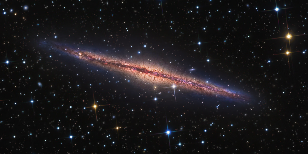
Although my main interest lies in small gas clouds (here meaning "quite a bit smaller than the Milky Way"), I have to admit that the giant features are basically the porn of the radio astronomy world. You can't really not be impressed by features like the Magellanic Stream, spanning more than half the sky yet not even vaguely suspected to exist until the twentieth century. 

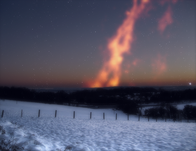
Here shown as it would appear from Cardiff, were it visible to the eye.

Well, I suppose you can be unimpressed, but then I'll look at you as though you have the same towering intellectual and spiritual capacity of a monkey that enjoys hurling its own faeces at other monkeys.

Anyway, the Leo Group harbours one such nerd-bonder-inducing feature : the Leo Ring. It's 200 kpc (650,000 light years) across and has a mass of gas of well over a billion Suns.

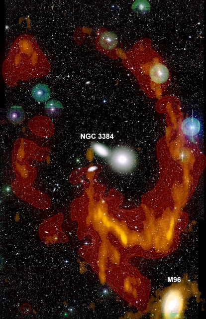
The Ring itself (here shown from an earlier survey) isn't quite a gas cloud that isn't doing anything. Some evidence has been found that there is in fact star formation happening within it, at least in localised areas - though most of it remains dark.

When you're planning a survey with extreme sensitivity, a region like this is a natural target field. I mean, can you think of any reasons not to do a survey of a giant gas ring with better sensitivity than any previous observations ? Of course you can't, because there aren't any.

Or somewhat more prosaically, the deeper the search, the more likely we are to reveal clues to its formation. Gas is never totally stable, and even once removed from a galaxy it can become dispersed or dissolved by a variety of processes. It might collapse under its own gravity to form stars (forming so-called "tidal dwarf galaxies"). Or it might be of such low density and high velocity dispersion that it simply flies apart, fading into undetectability. Or, it might be subject to ionising radiation and so change from nice, easily detectable neutral atomic hydrogen (which we can see with a radio telescope) into ionised gas (which we can't - or more accurately, requires totally different observing techniques).

But the Ring is not the subject of today's paper, not because it isn't awesome, but because we didn't find anything new that leaps out and says, "hey, look at this !". This isn't to say we found no new features in the Ring at all - we did, and some of them might be important. We just didn't find anything that adds anything of immediate value. So our focus on the Ring is now very much on numerical simulations, a project which is going to take a long while to bear fruit. We did, however, find something else that offers a much faster route to publication.


Six Little Clouds

That's right : not only does this region have the giant Ring, but it also has little gas clouds that don't do anything as well ! I could hardly ask for more. In fact I'd better go have a cold shower.

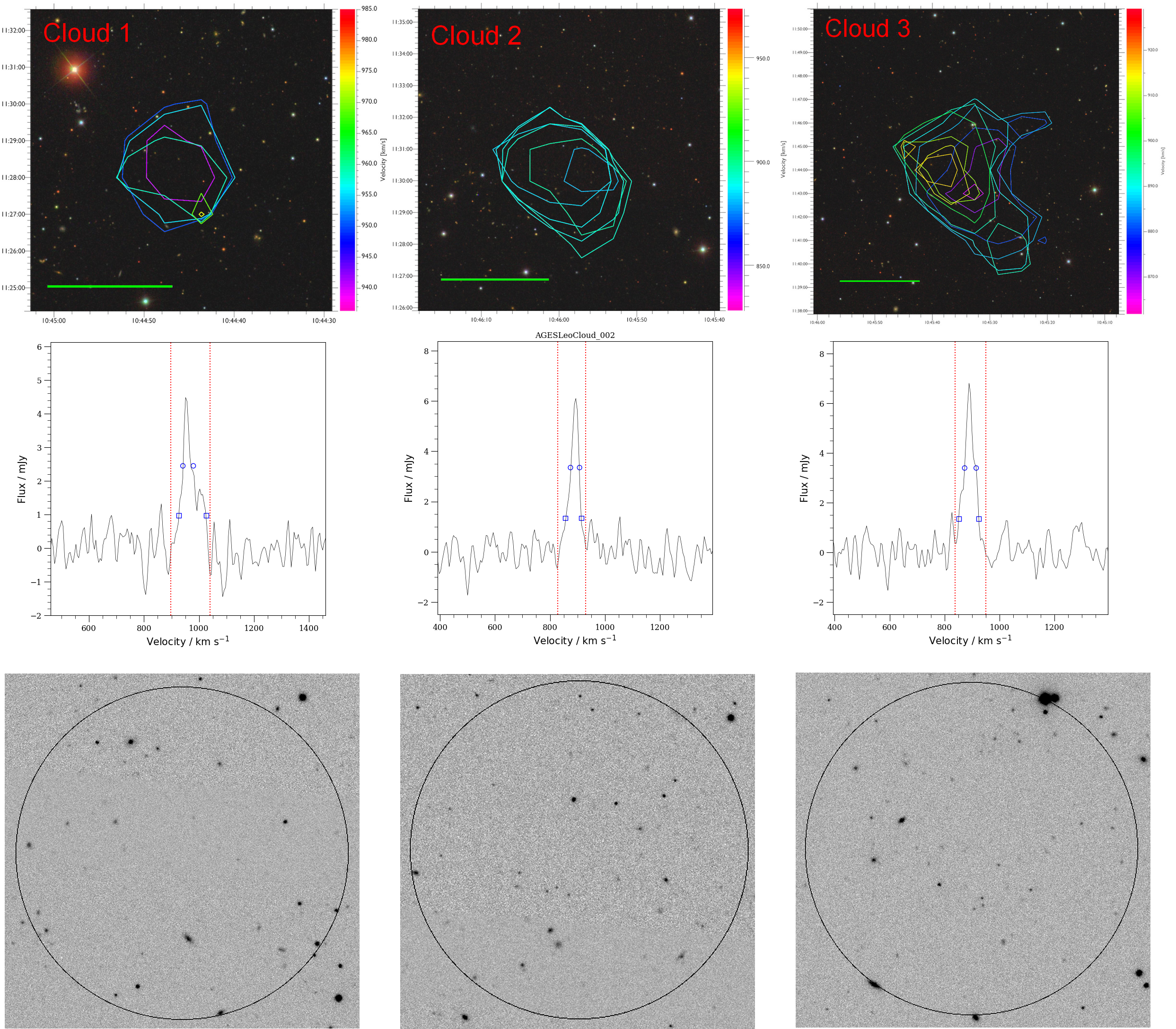
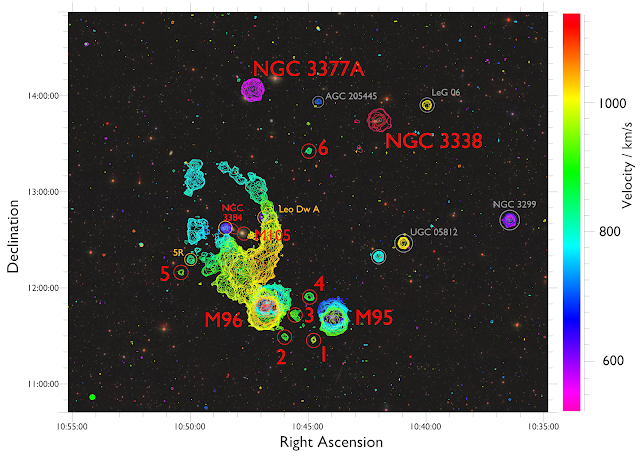
You can see an interactive 3D version of this here.

The really nice thing about radio observations like this is that we can measure what velocity the gas is moving at as well as how bright it is. That's what the colours of the contours show. It doesn't show the full data set though - we limited ourselves to a velocity range corresponding to everything that could plausibly be associated with the Leo Group in which the Ring resides. That's believed to be at a distance of about 11 Mpc (36 million light years).

There's quite a lot going on this plot but really it's pretty simple. The big red labels show the major galaxies and the clouds themselves. Other galaxies are highlighted with grey circles, really just to indicate that we catalogued them and haven't rudely ignored them - we need to know about them, but they're not important for this study. Similarly the orangey circles highlight features we use for a few comparisons but don't examine in any detail.

It's pretty hard to see on a plot of this scale, but every object apart from the six red circles (and 5R) has a clear, obvious optical counterpart. Much like Messier's "not a comet" catalogue, for today's purposes, labelling these is really just to show everyone we know they're there.

Let's start with the six clouds that form our main sample. We can look at these in more detail :


The top row shows the contours on a pretty-picture optical view, the middle row shows the spectra, and the bottom row shows the optical view in a boring greyscale colour scheme that more clearly shows there's nothing there (with one exception).


In some ways the clouds are all quite similar. Their masses are all a few million times the mass of the Sun, and their line widths are all about 50 km/s. This is a measure of how fast the gas is moving around within the cloud along our line of sight, which we get from the spectra in the above plot. Spectra show how bright the emission is at any given velocity, with the line width meaning the difference between the emission at its highest and lowest velocities. Measuring this is easy enough, but interpreting its meaning - as we'll see - turns out to be quite subtle.

Going purely on where they are, an obvious thing to do would be to wave one's hands and declare clouds 1-4 to be tidal debris (they're right in between two massive spiral galaxies which could well be dukin' it out interacting with each other), cloud 5 to be part of the Ring, and cloud 6 to be a bit odd. And that might turn out to be not so very wide of the mark... but the full complexity is more interesting. 


Six Not-Quite-So-Little Clouds

Even at the basic level the clouds are not as similar as they first appear. Cloud 1 has a line width quite a lot higher than the others, whereas cloud 5 is uniquely close to the Ring and quite a lot less massive than the rest. Clouds 1-4 seem to form a nice little population, but cloud 4 actually does have an optical counterpart.

Umm... but doesn't that mean it isn't a gas cloud that doesn't do anything ? And therefore really boring ?

Yes but no. In every other respect it's similar to the clouds : its mass and line width are typical, and it's found in close proximity to clouds 1-3 as well as being at very similar velocities. If you were given just the gas data, you'd never suspect it was any different to the other clouds. It's a great example of the situation I mentioned earlier, of having some clouds readily forming stars while others just don't.

(It's just about possible that the optical counterpart isn't actually associated with the gas : it could be at a different distance away from us. But if so, this would make it unique among the entire AGES sample so far. We have no other cases of optical counterparts found this close to the coordinates of the gas that didn't turn out to be associated.)

To figure out what's going on we need to dive a little deeper. Here's a zoom-in of the region where clouds 1-4 are found.
Cloud 7 is a little blob that appeared after smoothing. It may or may not be real, we don't know.

Notice here we have both thick and thin contours. The thin contours come from smoothing the data, which improves our sensitivity though at the cost of degrading our velocity resolution. This was a pretty neat trick (I think it was Robert Minchin who suggested this). See, while you can hand-wavily declare clouds 1-4 to likely be tidal debris, they don't really look all that similar to the classic debris-structures. Simulations have shown for decades that this produces a characteristic tail and counter-tail on the parent galaxy, but that's just not what we're seeing here (in particular, M95 is pretty much undisturbed, apparently sailing serenely through the cosmic chaos raging all about it). And we also noticed that cloud 1 has that higher velocity width. So we thought that maybe if we smooth the cube in velocity, we might discover a larger, more... easily interpreted structure.

Well, we didn't. Why not ?

We don't know. The puzzling thing is that the smoothed contours are different to the standard ones, but not at all in the way we expected. With satisfying irony, the only cloud whose appearance isn't changed by the smoothing is cloud 1, the very one of which we were most expecting to see more extended features !

What actually happens is this. Cloud 1 looks unchanged, as do the big spiral galaxies M95 and M96. Cloud 2 appears to be connected to the spiral galaxy M96 by a narrow tendril, not much resembling a standard tidal feature. Cloud 3 is significantly more extended (some hints of that can be seen in the original data), while cloud 4 also shows some quite strong hints of being more extended as well. And while a new feature, tentatively but unimaginatively dubbed cloud 7, appears, there's absolutely no hint of any really large-scale bridge linking the two spirals, which would have been a "smoking gun" signature of a tidal encounter between them. Indeed, much of their outermost regions look completely unimpressed by everything that's going on around them.

Especially appropriate because dispersion is exactly what we'd expect.

That cloud 4 is a bit more extended is a particular puzzle. We speculated that, being the most massive of the clouds (albeit only very marginally), maybe it was also the most compact and densest. Higher density means more star formation, but actually it looks like its density can't be much different to the others, and if anything is likely to be on the low side. So why is this one forming stars but the others are being a bunch of lazy buggers ?

Again, we don't know. Let's try a different approach.


Six... Totally Unique Little Clouds ?

Remember the line width ? For normal galaxies, this is basically equivalent to rotation speed (if you read the previous post you'll know all about the subtleties of this). But remember, strictly speaking, this is not what it's really measuring. What it actually tells you is the difference between the lowest and highest line-of-sight velocities of a feature - that is, how fast each part is moving towards or away from us.

(Now to be really strict, distance and velocity aren't the same. In principle, a cloud detected at a velocity of, say, 100 km/s could be at a different distance of one moving at 101 km/s even if they were found at the exact same position on the sky. So in theory, each of these "six" clouds could actually be lots of clouds that had all just decided to line up very neatly along our line of sight. But this is fantastically unlikely bordering on silly : on large scales, distance does (famously !) correlate with velocity, so it's a very safe assumption that each of these clouds really is just one feature.)

Unfortunately we can't just simply assume line width represents rotation in all cases. For normal, star-filled galaxies this is a safe assumption, for the most part. There's a very neat relation between the "baryonic" mass (stars + gas) of a galaxy and its rotation speed. This is the Baryonic Tully-Fisher Relation :

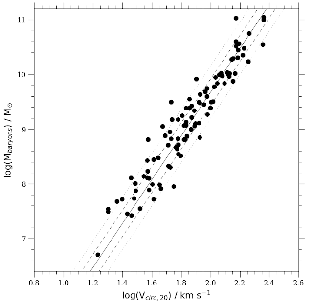
I've simplified this just a tad, removing a few known and explicable outliers and combining a couple of different data sets. The axes are in logarithmic units, with the vertical one being mass and the horizontal one being rotation speed. Dotted and dashed lines show the scatter at different significance levels.

This relation was found for observations which had much higher resolution than the AGES ones, where we can really see that one side of the galaxy is moving faster or slower than the other, giving us a true rotation curve. With our data, we just have to assume the line width represents rotation. But take a moment to just marvel about bloody frickin' impressive this relation is : it holds for galaxies rotating from 15 to 250 km/s, ranging in mass from a few million to a hundred billion times the mass of the Sun.

Opinion is divided as to whether this represents something inexplicable and impressive or monumentally dull, but either way, it's pretty neat.

And then, take another moment to appreciate that making this plot requires a wheelbarrow full of work. I'll simplify here so people don't die of boredom, but if you want the full, grisly details, see the previous post.


Right, are we all impressed enough yet ? Good. Let's continue.

Line width is definitely a good measure of rotation for normal galaxies, because we see the width gives a stonkingly similar location on the BTFR plot to true rotation velocity. When we then add in the dark clouds though :

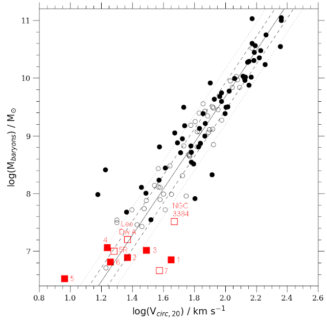
Here I've split the galaxies back into their original samples : filled black circles show the data from AGES (now also including some outliers), while open black circles show ones with proper rotation curves. Red filled squares show the main Leo clouds while the open squares show other selected features in the same region.

Which to be honest is not a lot of help, and maybe makes things if anything more confusing as to the clouds...

There's a very simple thing that might help to keep in mind as things about to get worse. Normal, rotating galaxies are proven to lie on the BTFR, with only rare exceptions. So something on the BTFR, naively, can be presumed to be a galaxy. Conversely, there's no reason at all to expect unstable, non-rotating bits of fluff to follow the BTFR, so anything not following the standard relation is more likely to be debris. Keep that in mind as your anchor point.

Let's take this one step at a time. Ignore everything else and have a look at clouds 1-3. Since these are right between the two big spirals, it seems a very good bet that they're tidal in origin, even if they don't look much like typical tidal features. 

Now cloud 1 does seem to play ball. It lies well outside the general scatter of this BTFR: if this were rotation, it would be far higher than you'd expect for a galaxy of this mass - which would be absolutely consistent with it being unstable tidal debris that's in the process of dissolving. Hooray !


Except... maybe not. The thing is, cloud 1 is unresolved in our data, showing no signs of any extensions as we'd expect it to have if it was debris. But cloud 2, which does show such extensions, is in good agreement with the BTFR. So cloud 1's shape doesn't fit with a tidal origin, but its velocity does, whereas for cloud 2 it's the exact opposite. This is rather confusing.


Maybe this is just a bit of an odd fluke ? Well, let's try cloud 3 then... ahh, no help there. This one is much more debris-like after smoothing - it's the most extended of all - but though it too has a higher velocity width than the BTFR predicts, the difference is only marginal. It's by far the most extended but arguably still consistent with the general scatter in the BTFR. 

Okay... cloud 4 ? Here things are a bit better. Having an optical counterpart and therefore quite probably just being a normal galaxy, this one agrees with the BTFR quite well. So that's something. And so does the very faint (but definitely a galaxy) Leo Dw A. Hooray ! The problem is that so does cloud 6, and also 5R (a feature most likely just part of the Ring), which don't have optical counterparts.

Now there's an exciting possibility for cloud 6 which I'll get back to soon. But if it's unstable debris, as cloud 5R almost certainly is, there's absolutely no reason to expect it to follow the same relations as for rotating stable galaxies. And some clouds known from other surveys (not shown here) also do the same thing. 

In short, the clouds don't really match our expectations of the BTFR very well at all - they're not totally at variance with it, but they're not in great agreement either. The take away message is basically this :


Those other extra features (the open red squares) aren't any help either. Cloud 7 is offset, but we're not even sure if it's real, while the cloud near NGC 3384 (a big elliptical galaxy at the centre of the Ring) is somewhat deviant but likely has a lot of measurement errors, so its velocity width is probably overestimated.


Six Sensitive Little Clouds

Hang on, there could be an easy way of of this wretched mess. Forget the physics for a moment and try instead the statistics. What I mean is, we could be having an unpleasant attack of a selection effect. 

It looks as though most features follow the BTFR or are only marginally offset. But maybe we only find clouds in this region of the BTFR because that's the only place we can find them, and they're just extreme examples of a population which is by and large normal. This is possible. After all, we do find a couple of clear outliers.

There's a few different effects at work here. For a cloud of any given mass, it's easier to detect if it has a smaller line width - all its flux is "bunched up" and appears brighter. Similarly at any given line width, clouds of higher masses are easier to detect. But at some point we expect the mass to be so high that we should have star formation*, so they'll no longer be optically dark. Fortunately we can quantify all this, and we find that...

* Strictly speaking it's density rather than mass that matters, but this is something we can account for.

There's really not much constraint on the clouds to be in this part of the BTFR at all. Bugger.

It turns out that we can easily detect clouds of the same mass with much wider widths than these, and other clouds are known which are a hundred times as massive and not forming stars. So width doesn't limit which ones we can detect, and the requirement that the clouds aren't star-forming doesn't impose any real constraint either.

Right. Okay. That didn't help at all then.

There is another caveat though. We've seen that interpreting line width can be complicated, but actually, measuring it isn't quite so straightforward either. It isn't like measuring the peak brightness - there isn't one unique width value that gives you the right answer. Instead we have to choose which conventionally-accepted procedure we want to adopt. Normally we measure the width at either half or a fifth of the peak brightness level, and there are calibrations we can apply to convert these values to true rotation speed. But naturally, this isn't perfect. And likewise, correcting the stellar mass of a galaxy is subject to a host of choices as to which method of converting brightness to mass one happens to prefer.

All this means that there is some considerable scope for shifting the best-fit line of the BTFR, as discussed in depth previously. I'm only showing this particular version of the BTFR here because it's the best and most carefully-calibrated version, but it would be going a bit too far to pronounce it as definitive. In any case, we could shift the line at least a little bit, changing which ones agree with the BTFR and which ones don't - but this is a pretty weak effect, and definitely doesn't solve everything.


Six Sexy Little Clouds ?

So let's presume this version is correct or we'll get nowhere. If statistics can't help us, it's time to bring in the physics.


For this, let's shift to cloud 6. This one is pretty much in the middle of nowhere. None of the galaxies near to it have signs of extensions, and they're anyway at such different velocities that they're likely at very different distances away from us. So it doesn't look anything like classical tidal debris, and its line width is consistent with being a perfectly normal galaxy on the BTFR... yet it has no visible stars

Could this be one of the semi-mythical starless "dark galaxies" of song and story ? Such objects would solve a huge, long-standing problem in cosmology, that simulations predict far more galaxies than surveys detect. So this would be a Big Deal if this was the case.

The answer is... yes ! It could. Well, maybe. To be strictly accurate, I would phrase it thus : the dark galaxy hypothesis is a valid explanation that should not yet be rejected. I'd be willing to go a little further and say that it's hard to see how cloud 6 could have formed by tidal encounters, there being no obvious signs of any features that gave rise to it. The Leo Ring is miles and miles away, and it's damned hard to see what sort of event could create a giant, coherent, massive arc of material and also one teeny-tiny compact little blob that's so well-separated from it.

Of course this needs to be tempered. Without a full explanation of the formation of the Ring, we can't say for sure that it isn't just some weird outlying blob. Or we could look at it the other way around, and say that if we assume it is some outlying blob, this gives us a powerful constraint on the formation of the Ring. Either way, it's a valuable blob, to be sure.

If we can't reject the dark galaxy hypothesis for this cloud, what about the others ? Well, now I'm afraid I need to take the stabilisers off and contradict what I said earlier. Just because something is deviant from the BTFR doesn't guarantee it's not a galaxy. There are known examples of very massive galaxies that rotate too quickly, of very faint galaxies which rotate too slowly, and we have good reasons to expect there to be more scatter in the BTFR than we actually see.

And, if line width represents dispersion (i.e. expansion) instead of rotation, then the objects with the highest line width should be the hardest to detect because they'll become undetectable most quickly. This makes rotation (which implies dark matter) actually a much better explanation in these cases, which is something I've previously shown at length - with rotation, you can be stable at any velocity width indefinitely. For galaxies, the secret to immortality is just to spin round really fast.

Disclaimer : spinning yourself or your pets won't help you live longer.

So alas, there's no clear, take-home message from this. The clouds simply don't fit a nice neat narrative, which is why the high-school description of science as a process of hypothesis testing is fundamentally flawed. Far better to remember that's a much more complex network of exploration and examination. Depending on your point of view, you could easily present the data to favour or disfavour whatever you need it to.

With that in mind, here's how I'd sell it. It's my paper, after all.


Summary and Conclusions

These nice little clouds have similar masses and line widths, but even among this small population there's no small degree of complexity. Let's start with a summary of each of the clouds. 
  • Cloud 1 is between the two big spirals. It has much the largest velocity width, but smoothing didn't reveal it had any kind of extended component. Its location and line width suggest a tidal formation mechanism, but its lack of extension doesn't fit this view.
  • Cloud 2 is between the two big spirals. It has a typical velocity width and smoothing reveals it has an extended "tendril" connecting it to one of the spirals. Its location and extension imply a tidal origin, but its agreement with the BTFR is unexpected, and its extension doesn't really fit the general expectation for tidal debris.
  • Cloud 3 is between the two big spirals. It has a typical velocity width and smoothing reveals it is significantly extended, though not connected to either galaxy. It is marginally deviant from the BTFR, and generally just ambiguous all-round.
  • Cloud 4 is between the two big spirals. It has a typical velocity width and is at a similar location to clouds 1-3, but uniquely has a clear optical counterpart. Its mass is only marginally greater than the others and smoothing reveals it may be slightly extended, so its density doesn't seem likely to explain why it alone has formed stars. It follows the BTFR of normal galaxies.
  • Cloud 5 is close to the Ring, and it's hard to tell if this is really a discrete feature or not. Smoothing revealed no signs of anything extended.
  • Cloud 6 is as isolated as anything can be in this region. It lies on the the BTFR for normal galaxies but, like the other clouds, has no optical counterpart. The galaxies nearest to it on the sky are actually likely to be at quite different distances, and none of them show signs of extensions anyway.
So the clouds differ in terms of their environment, line width, optical emission, and extension. Six clouds that vary in four different ways... that's so much diversity they're practically woke.

Now the optical counterpart to cloud 4 is clear enough, though it is quite faint. But thanks to the presence of the Ring, this region has been subject to a host of much, much deeper surveys, and none of them have reported anything at all at the positions of the other clouds. So if any of the other clouds do have optical counterparts, it's likely that they're an awful lot fainter. It's just not at all obvious why one cloud should be bright and the others aren't.

It's tempting to say that cloud 4 is a normal galaxy that just happens to have wandered in to the mess around it. That may be so. It could just be an innocent bystander that's wandered into a bad neighbourhood, and is going to get a nasty surprise when it realises some astronomers are gossiping about it behind its back.


But I'd say it's at least viable to say it might be a cloud that's had it's star formation triggered as it's wandered in - it looks so similar to the other clouds, it just seems weird to think this is a coincidence. Or perhaps the opposite is going on. Maybe it's not the first but the last cloud to have had its star formation episode, with the others having already faded into their current darkness. We really don't know.

With the clouds we found in an earlier AGES study of the Virgo cluster, we used their line widths to try and constrain their evolution, and we did the same here. If we assume the line width is how fast the clouds are dispersing, we can calculate how fast they'd have to have travelled to reach their current distance from their nearest galaxies while still being detectable. And in Virgo we found that this was so fast as to be really quite implausible.

Annoyingly the Leo clouds are on the margins. Their line widths aren't so high, so they wouldn't have had to have moved so fast. It would be quite a bit higher than expected in a group like this though, and that the clouds are at nearly identical velocities to the other galaxies speaks against this. But it's not a strong constraint, especially as we have no idea how fast anything is moving across the sky. In short, the line widths are consistent with the clouds being both tidal debris and dark galaxies, which isn't much use.


Here's my best guess. Clouds 1, 2, 3, 5 are all unusual forms of tidal debris, relating to the formation of the Leo Ring, with the bright spiral galaxy M95 not being involved at all. They may or may not be in a state just before or after a period of star formation, depending on whether cloud 4 is a normal galaxy or another cloud. Cloud 6 might be some long-lived tidal debris from some other, unrelated interaction, with the rest of its parent stream having already dispersed, though the possibility that it could be a dark galaxy needs to be given serious consideration.

The elephant in the room is that bloody great Ring, of course. It does seem to be connected to the spiral galaxy M96, but it almost looks like it's just superimposed, and doesn't represent any major damage done. And its overall structure is just frightening complex. Very plausibly, it involves five interacting giant galaxies, which means a parameter space which is hideously vast. Is it crucial or irrelevant ? We just don't know.

Humanity has a love-hate relationship with rings which is so powerful that it's literally mythical.

So what're we going to do this figure this out ? 

Oh, pish, y'all know the answer, it's a cliché even more entrenched than magical rings. Come on, all together now :

WE

NEED

MORE

DATA !!!!

In this case we're going to need more data from both observations and simulations. We need to figure out ways that stupid Ring could have formed, and then we need to test it all against observational data. Our clever tricks to increase the sensitivity have associated penalties, so really we just need better original data.

Without Arecibo this is hard. So my idea is to write to Jeff Bezos and pitch a sequel-prequel series : Radio Rings of Power. They're the size of galaxies and don't do anything, but I'm sure if we throw in enough sex and violence they executives will beat a path to our door. Stay tuned.

Friday 23 September 2022

The best best fit

Do you know what my ever-so-lovely girlfriend said to me the other day ? 

She said I'd make a terrible detective.

Well !

"Scientists are like detectives" is practically outreach 101. It's standard practise for explaining science to children. So such a claim is so outlandish as to require a weeks' answer or none, so I settled on an intended look of blank bafflement which I'm afraid probably ended up as more of a scowl. 

But it gets worse. Apparently I was failing to only adjust one variable at once.

I mean, really ! There's several tens of thousands of lines of meticulously debugged Python code that will attest otherwise.

But describing the process of debugging code is about as exciting as watching the George Clooney version of Solaris in slow motion. Let me instead give a much more fun example of science-as-detectoring with a figure in my latest paper. This is a not a brand new plot, but a very famous discovery to which I've added my own meagre data. I'll cover the science of my own work in a the next post - in this one I want to look more at the background and the major aspects of what it shows.

This infamous Tully-Fisher relation is deceptively simple : a nice straight line plotting how one variable affects one other. At it simplest, it says that bigger galaxies spin faster, which is just about one of the most boring things you can say about them. Hundreds of billions of stars, uncounted planets, supernovae, great hulking black holes at their heart, the not-quite-infinite majesty of the darkened cosmos... nope, today, "big ones are more spinny".

Really, this is what we're going with ? Oh. Okay.

Start to look a little closer though, and the Tully-Fisher relation blossoms into a bewildering array of complexity and ugly truths. This is a good opportunity to examine just how messy the coalface of research can really be, and a reminder that while science certainly does depend very strongly on rigorous, objective facts, it has no small component of subjective choice behind it too. It's also a good example of how much frickin' work goes into a single bloody plot.

Surely the term "data mining" must have originated in Wales.

This is for once an intentionally long post. If, though, you're already familiar with the Tully-Fisher relation, or don't really care about it very much, feel free to scroll ahead to section four.


1) The Tully-Fisher Relation And How To Measure It

Here's the plot. For an astronomy post I'm afraid this one is going to need quite a lot of graphs and precious few pretty pictures of galaxies.

Simplified by a just a smidgen.

This is the original version from a famous 1977 paper by Brent Tully and James Fisher. What it shows is how bright a galaxy is (vertical axis) as a function of how fast it's rotating (horizontal axis). Regular readers will know I've shown versions of it before because although the basics are simple, the devil is in the details - and the devil is a jolly interesting chap if nothing else.

Let's look at the basics first though. We'll get to exorcising demons examining the details later. First, here's how we get the data.


Measuring the brightness

In this original plot the vertical axis is how bright the galaxies are at ordinary optical wavelengths. Astronomers use a horrible thing called the magnitude system, which expresses brightness in some convenient but monstrously unintuitive and literally arse-backwards way*. The simplest version is apparent magnitude, which just means how bright things appear in the raw observations from the sky. 

* The brighter something is, the more negative its magnitude. I mean, come on.


A nice chart I found here. The Andromeda Galaxy is about +3.4.

Problem is, this tells you little or nothing about the physics of what you're looking at. For that, as in the Tully-Fisher plot, you have to convert to absolute magnitude. This is what the apparent magnitude would be if you were a fixed distance (10 parsecs, about 33 light years) from the source. Keeping everything at the same distance means you can make fair comparisons. For the enthusiasts, absolute magnitudes for galaxies typically range from about -20 (very bright) to -10 (very faint), but these aren't strict limits at all.

The conversion from apparent to absolute magnitude is easy as long as you know the distance. Admittedly, getting this can be extremely difficult, depending on how accurate you need to be. But let's tackle the other variable in the plot first.


Measuring the rotation

Finding out how fast galaxies are spinning is a bit more complicated because there are several different ways to measure this. The most obvious is to simply sit back and watch the stars move across the sky (their "proper motions"*). But that's only really possible in our own and the very nearest galaxies. And to determine their full 3D motion, we need to measure their speed towards or away from us - that is, along our line of sight.

* I have no idea where this term comes from. A Google search for "improper motion" returns results about everything from flawed legal practises to unpleasant bowel movements.

That turns out to be much easier : we can measure the redshift of stars surprisingly easily, even at very large distances indeed. And this has some key advantages. Here's a simple model of a galaxy showing how things rotate relative to an observer. If we're viewing it face-on :

With a reasonably realistic rotation pattern but a very simplistic distribution of stars.

All this movement is in the plane of the screen sky, which means in this case we've no option but to sit and wait long enough to see something move - redshifts won't help here. This gets a trifle dull after a millennium or two, so face-on galaxies aren't much use. Whereas if we're edge-on :

In the middle, all of the movement is across the screen, with nothing moving towards or away from us. But at the sides, all the motion is towards or away from us. Here, measuring motion across the sky would be very tough, but redshifts become easy, and then give us the rotation velocity directly. For galaxies to have stable rotation and not be tearing themselves to bits, the rotation speed at their edges must be the same as everywhere else.

Well... it's not quite that simple, unfortunately. If we happen to see a galaxy which is exactly edge-on, then the stars right at the edges will indeed tell us exactly how fast they're rotating, directly - with no need for any further corrections at all.

Like NGC 891, for example.

Of course most galaxies don't happen to line up with us like that otherwise we'd have to seriously consider Intelligent Design as a legitimate theory, assuming that the whole point of the Universe was so that human beings could do really good extragalactic astronomy*. Most galaxies are somewhere in between face-on and edge-on. But, provided they're not too close to the former**, and we assume they're basically circular in shape, it's easy enough to correct for this.

* Not that we need Intelligent Design to assume that, of course. It goes without saying the astronomers are obviously the highest form of life.
** The errors in this are pretty large : a galaxy has to be more than around 30 degrees or so inclined away from us for this correction to work, otherwise the correction becomes so great that small measurement errors lead to big problems. 

A second problem is that actually, using starlight is not a good idea. Stars are usually embedded in much larger gaseous discs, which we observe with radio telescopes. Using those measurements, we find that the stars don't probe the full extent of this rotation curve : that is, they'll underestimate how fast the galaxy is truly rotating.

This is one of the main pieces of evidence for dark matter. Without extra, unseen mass to hold it all together, most galaxies are rotating so fast they ought to quickly fly apart

Now to get a nice rotation curve like that one isn't easy. You need to have observations of the gas of very high resolution, so you can see exactly which bit is moving at which velocity, and that's technically difficult to do. What's much easier, however, is to get an observation which integrates all the gas in the galaxy at once. What you see in such data is a bunch of blobs : you can't see any structure to them at all, all your spatial information is blurred out - but you can still see the velocity range over which they're detected. You can plot this very easily as a spectrum, which shows how bright the gas is (or rather, how much there is) as a function of velocity :

By measuring where the real emission begins and ends, we get a line width. Where exactly you choose to make the measurement is a bit tricky, but the usual convention is to measure it at either 50% or 20% of the peak brightness (flux) level : the W50 or W20 parameters. Generally these are similar, though not always. In combination with the inclination which we estimate from the optical data, we can correct it to get a estimate of the true rotation speed.

So this is pretty complicated already. Brightness is okay, but rotation is quite tricky. 

BUT, we do have some cases where we can get those nice rotation curves, so we can compare the line width measurements with these... and it works well. It's certainly not ideal, but it does work.


Measuring the distance

But wait ! Remember, we can't estimate the intrinsic brightness without knowing how far away the galaxies are. Now Tully & Fisher had a sample of galaxies for which they did have decent distance measurements (there are various ways to estimate this). What they found was that this relation between rotation speed and brightness is so good, you can use it as another way to estimate distance.

That is, you can very easily measure the apparent magnitude of a galaxy, and quite easily determine its line width. With these two measurements, assuming the Tully-Fisher relation holds, it's then easy enough to work out the galaxy's distance for its absolute magnitude to match the prediction.

I'll spare you the details of measuring distances except to note Hubble's famous law : the faster a galaxy is moving away from us (which is another thing that's easy to measure), the further away it is. This law isn't perfect, galaxies can have "peculiar motions" which deviate from the large-scale flow. But it's pretty darn good. So on very large scales, in most cases we can get a reliable distance estimate very easily. And that lets use use the TFR in a completely different and much more interesting way than as a glorified tape measure. 


2) The Baryonic Tully-Fisher Relation

It might help to take stock of how complicated this relation has already become. To measure rotation speed we need to get the line width and also inclination, which means combining data from very different wavelengths. We can't do this viewing-angle correction at all unless galaxies are more inclined than about 30 degrees, otherwise the errors are too large. And using the line width is never quite as good as measuring a proper rotation curve.

In contrast, measuring the brightness is quite a lot easier. Or at least, it was, until Stacy McGaugh came along and made everything more complicated.

They're darned ugly plots, I know, but don't blame me !

McGaugh found a sample of galaxies that stubbornly refused to obey the standard TFR (green points on the left). There didn't seem to be anything wrong with the measurements, they just rebelliously failed to follow the trend. But when he changed the vertical axis from brightness to mass, everything changed. On the right, the green points now happily agreed with all the others : a nice neat line reappeared !

McGaugh called this the baryonic Tully-Fisher Relation. "Baryonic" being just a fancy word for "normal matter", the stars and gas we're all familiar with - as opposed to the more exotic "dark matter", which remains mysterious.

Why does this work ? In bright galaxies, their baryonic mass is dominated by stars. So using either stellar mass or brightness will give the same result, and adding in the gas doesn't do anything. But in faint galaxies it's the opposite. Their baryonic mass is dominated by gas, so you have to use the gas mass for those and you can ignore the horrible stars.

What's interesting is this reveals the original Tully-Fisher relation was just one particular form of a more fundamental relation. Replacing brightness with mass puts it on a much more physical footing : brightness depends on what wavelength you're using, but mass is mass. And notice how vast the mass range here is, from ten million to a hundred billion times the mass of the Sun. This relationship holds across four orders of magnitude - a factor of ten thousand. Clearly something important is going on.

In practical terms, measuring the mass of the gas turns out to be relatively easy. While converting the optical brightness to stellar mass is not at all trivial, it does seem to work. But before we get to the glorious nitty-gritty of all this, let's take a step back, assume the relation is basically right, and think about what it actually means.


3 Why Does It Do This ?

Sorry Homer, but worse is to come.

At a naïve, hand-waving level, this relation makes sense. A more massive galaxy has to spin faster to be stable against gravitational collapse. And though galaxies are mass-dominated by their dark matter, the more dark matter they have, the more gas they can accumulate and the more stars they can form. So it's not at all surprising to find that the faster-spinning galaxies (that is, the most massive objects) have the most gas and stars.

As I said at the start, big things spin faster. Whoop-dee-bloody-doo, another marvellous scientific breakthrough. Your tax dollars* at work.

* Actually, Czech crowns. But you get the idea.

But... what should the exact relation be ? Should it be the same for all galaxies ? What about those that don't have any gas at all ? What about those which are interacting with other galaxies ?

This is where it gets complicated, and sometimes extremely puzzling. First, in clusters galaxies are prone to losing large amounts of gas through a process that doesn't much affect their stars. When enough of their gas is removed, what remains is the most tightly-held stuff in the very centre, which doesn't probe the full rotation curve. So these highly gas-deficient galaxies don't follow the BTFR, but this is most likely just because we're not able to measure their rotation correctly : intrinsically, they probably do follow the usual relation.

Some galaxies not only lack gas completely but have likely done so for many billions of years. These "elliptical" and "lenticular" galaxies tend not to have rotating discs, so plotting these on the BTRF wouldn't really make any sense. However, they have their own version : the Faber-Jackson relation . Rather than rotation, velocity dispersion - the speed of random motions - correlates very well with their total brightness. The principle is exactly the same as the BTFR, in that the stars have to be moving faster to maintain stable orbits (and even the quantitative gradient of the relations is the same), it's just that they don't do so in coherent rotating discs as in spiral galaxies.

So those points are probably only minor caveats. But optically faint galaxies are another story. Yes, it's nice that if you plot their total mass they agree with the main relation... but this is not at all what was expected.

This comes about from a clever mathematical trick. It's actually possible to predict the Tully-Fisher relation using some simple equations :


You don't have to go through all this. I just like making myself look clever.

The equation predicts that the baryonic mass (Mbar) should scale in proportion to velocity (v) to the fourth power. Which is exactly what it does. Hooray ! But it also shows that it should scale according to two other parameters : the mass-to-light ratio of the whole galaxy and its average surface mass density. And it doesn't do that. It appears that these exactly cancel each other out, and no-one has any idea why. 

In other words, there should be a lot of scatter in this relation. The more spread out the stars in a galaxy of a given mass, the lower its surface brightness and the more it should deviate. But in fact the scatter is very low, with some claiming that it's so low as to be consistent with pure observational errors. All galaxies appear to obey this relation perfectly. 

And that's just damned odd. It raises the suspicion that we're examining not just the processes governing galaxy formation and evolution, but something altogether more fundamental, not galaxy-specific but relating to physics itself : in a word, gravity.

How much scatter is there, exactly ? Given the possible importance of this, in the last few years this has become controversial. There are now a host of challengers to this apparently universal relation, above and beyond the gas-deficient objects which are generally considered to be a bit dull. That's why I cheekily called it a "non-relation" in the last picture, though this is a bit facetious.

Because I'm just so damned edgy.

Chief among these are the Ultra Diffuse Galaxies, which have very low surface brightnesses indeed, as well as some other much brighter (but still small) objects. But there are also so-called "super spirals", the biggest and brightest spiral galaxies of all. And of course there are my own favourites, the optically dark gas clouds which seem to be rotating like galaxies.

What this all means depends on what really gives rise to the BTFR. If it's some detailed aspect of galaxy formation, then there's probably nothing very interesting going on. But if it's something really fundamental like gravity, then things get much more complicated. The most radical interpretation would be that the perfection of the BTFR actually constitutes evidence for a different theory of gravity that replaces dark matter (though as far as I can tell, this doesn't really stand up, and it can probably be accommodated just find in the conventional paradigm*).

* In principle, if it's gravity at work, then all stable systems in equilibrium should follow this relation. But establishing whether a system really is in stable equilibrium is not always easy, so outliers don't automatically constitute proof that we've disproven any alternative theories of gravity.

All of these challengers to the neatness of the BTFR have their own issues. Measuring the inclination angle for UDGs is extremely difficult and it's by no means clear that estimates are correct - while they appear to be rotating unexpectedly slowly, it's possible that they're just closer to face-on than we think. The same can't be said for the gas clouds, which rotate too quickly even without correcting for viewing angle*, but that they deviate in the opposite way to UDGs makes any connection between the very faint and truly dark objects hard to sustain. And super spirals do appear to be explicable by standard galaxy formation theory.

* This correction can only make the rotation larger than the observed line width. Some other corrections can reduce it, however, which we'll get to later.

So what's going on ? We don't know. If the BTFR really is as nice as it appears, this might be evidence that the theory of gravity is wrong, though it probably wouldn't be very good evidence by itself. On other other hand, if there's actually a strong scatter in the BTFR, we still need to explain how this happens and why it wasn't seen before. Basically, it's confusing but interesting every which way you look at it.


4) Mine Own Fit

One of the coolest things I've been unfortunate enough to discover is that some gas clouds in the Virgo cluster don't obey the standard BTFR. I've plotted this in different papers for years. Now it's not really surprising that some floofy gas clouds don't have the same dynamics as stable rotating galaxies, but simulations show that making clouds with line widths as high as these is damn near impossible. In contrast, if they were to be galaxies, but having a much larger dark matter content than most optically bright objects, this would explain everything pretty nicely.

Now along comes some new Arecibo Galaxy Environment Survey (AGES) data of the Leo Group. Here we found some more gas clouds, and the picture is quite different : some follow the BTFR, but some don't.

I have to say that the initial referee report was the nicest I've ever received, which frankly I think is only bloody fair as I've had far more unduly critical reports than I deserve for making entirely uncontroversial claims. But I digress. Anyway, this super-lovely referee asked if I could demonstrate more robustly whether these clouds really do sit on the BTFR or not. It was an entirely reasonable request, but it led me down a much deeper, more complicated rabbit hole than I ever would have guessed. In fact the whole sorry process ended up being exactly like this :

Here are the basic plots I started with :

All points use my own measurements except for the green ones, which use other people's reported measurements. The red points are the ones I was interested in.

The two plots are the same except in that the one of the left uses the "W50" measurement to estimate the rotation speed whereas the one on the right uses the "W20" parameter. You can see some of the black points - nice bright normal galaxies - have baryonic masses well above the best-fit dashed line using W50, but not using W20. That's because the spectral profiles can be asymmetrical. Sadly this has nothing to do with wonky ghosts : it just means that the emission is a lot brighter on one side than the other. So occasionally, the W50 value is much lower than it really should be, and the W20 value is generally the more accurate - though it too has its own problems, especially since it's measured at a level much closer to the noise. 

In short, W50 can sometimes give you erroneously slow rotation speeds, while W20 has the opposite problem - you have to pay close attention to the spectral profile.

Cheer up ghost, you're not that wonky.

The fit for the two different estimates for the line widths does change the interpretation somewhat. But most of them, eyeballing it, look to be consistent with the general scatter using the W50 version - most have higher velocities than the best-fit line, but only slightly. Using W20, there might be more of a deviation, though some clearly follow the general trend.

But in the course of addressing the reviewer's points, I found something else : I could not reproduce the best-fit lines ! All the data points themselves were fine, but how the hell I'd fitted the original lines I know not. Only through much toil did I eventually get a reproducible version that doesn't look too awful. The original W50 fit still looks better to me, but since I've no idea how I originally did it, this has to be discarded. Here are the replacement versions which appear in the published paper.

The best-fit is obtained only through the black points : bright, normal galaxies, with all the other points being dark gas clouds. The clouds themselves can't be used for the fit, since the goal was to see if they follow the usual relation for galaxies or not. While we can't change the values of the data, the fit matters in that this tells us if and how much the clouds deviate. In this version, the basic result still stands, but the clouds now agree better using the W20 than the W50 relation.

This at last is where we get to the title of this post : which best fit is the best best fit ? And that's tricky to answer. It might help if there were error bars, or if we compared the results to previous findings rather than relying on our own fit.

To that end, the referee quite rightly suggested to compare with the results of a later McGaugh paper. This is a good one to use because there McGaugh used a sample of gas-rich galaxies which were of similar masses to the Leo clouds, with proper rotation curves for all objects. Using a gas-rich sample means minimal problems with calculating the stellar mass, which, as we'll see very soon, can be a right bugger, and as we've already seen, rotation curves are much superior to using line widths.


A First Guess

So I set about to apply the corrections McGaugh describes for a fair comparison to his fit for the BTFR. My first quick attempt was very promising. Sure, the result isn't perfect for the more massive galaxies, but it's not too bad. There's more scatter than with McGaugh's data but that's to be expected since we have to use line widths, which aren't as accurate. 

The solid line show's McGaugh's relation, with the dashed and dotted lines showing the scatter at one and two sigma.

Those deviating black points probably wouldn't have bothered me except that they're all to the right - they all have higher velocity widths than expected. What could have gone wrong ? Could I have systematically overestimated the widths ? I went back and checked the spectra (this being data from ten years ago and more !) and found nothing much wrong. And then I realised there was a bug in my plotting code.

In the original plots I'd used my own measurements with the absolute minimum of corrections. So those, having at last found a reproducible best fit, are solid. To compare with McGaugh requires more sophisticated corrections, and there's a lot more to go wrong. For this one I'd started with a correction he prescribes to adjust the line widths, since these don't always give the same results as rotation curves (they tend to overestimate things a little). But I'd accidentally applied this correction to the logarithmic values used for the final plot, whereas it should have been done in linear units... !


A quick correction

Well, I couldn't leave well enough alone. I must admit I thought about pulling a fast one, but I just couldn't. Given how much it took to get the final result I almost wish I had... here's what happened when I corrected my mistake :

Booo ! It was just pure dumb luck coincidence that my original incorrect correction gave a better best fit than the correct correction. Doing things properly gave an unhappily worse result, with more of the galaxies deviating than before !


A new (mis)fit

Things went from bad to worse. I decided that if I was going to do this, I'd better do all the corrections McGaugh used, and not just pick-and-choose the factors which seemed likely to be dominant. So I tried plotting a sample from another paper (an ALFALFA paper - another Arecibo survey, not as sensitive as AGES but much larger) which did all this, and their results sat very nicely around McGaugh's trend. Even for galaxies matched with those in my own sample, their values were in good agreement, but mine weren't.

This led to a paper chase to find exactly what corrections were supposed to be applied. After combining absolutely everything, using my own data the result was... disappointing.

The normal galaxies barely follow McGaugh's relation at all ! At this point I began to seriously consider not showing them. And this would have been an entirely valid thing to do. The full set of corrections needed for optically bright galaxies (which I'll go through at the end) is a lot larger than what you need to do for the gas clouds, and it's those I was interested in. So the comparison between the gas clouds and McGaugh's relation is valid regardless of the terrible "fit" from the normal galaxies. Still, there are some corrections which apply to both samples, and if there was any systematic difference between our data and previous results, I'd rather know what the heck it was.

I can't say it was particularly fun, mind you.

The "correct" correction

At this stage I knew :

  • Using other people's data for the same galaxies gave a result in excellent agreement with McGaugh's relation
  • Using my own data but applying all the corrections described gave a wonky result that would shame an asymmetrical ghost
So there simply must be something wrong with my original measurements (and/or further bugs in my plotting code). But where ? I went right back to the raw, uncorrected values : the apparent magnitudes and line widths. The AGES and ALFALFA measurements were in good agreement on both counts, though not as much for the line widths. I picked out random galaxies and went through the entire correction process to see if I could spot what was going on.

Some dozens of plots later (that's only a slight an exaggeration), I found the solution.

It turns out there was nothing much wrong with either my magnitudes or line widths. ALFALFA have a much more sophisticated but hard-to-reproduce method for estimating the width, but that wasn't the problem. The problem was with my inclination angles*. In defiance of advice I'd been given years back, it was better by far to use the automatic values obtained through the optical survey catalogues**. So when I used these, together with all the corrections needed (which also involved finding more bugs in my code, but also typos and the wrong citations in other people's papers, as well as finding out that they were using a slightly but crucially different calibration parameter for stellar mass to the one I'd always used), I got...

* And also distances. Again, AGES generally uses a simple estimate for this, whereas ALFALFA have something more sophisticated.
** The SDSS is (or was) notorious for giving unreliable values, making it necessary to re-analyse the data by hand. At some point, it appears that this was dramatically improved.


(drumroll, please)


(continue waiting)


TA DA !


Err. Umm. Oh.

I mean, it's certainly a heck of an improvement. But it's hardly perfect - there's still a lot of scatter, especially galaxies with higher velocities than expected, and the slope of the galaxies still looks off - even if by only just a tad. And according to this, there are some galaxies which deviate just as much as those Virgo clouds (blue circles), which would rather undermine how interesting they are.

Well, bugger.


Correctly correcting the correct correction

The final step turned out to be much less onerous. I'd already tried plotting the AGES-ALFALFA matched sample and found a much better agreement than in that last plot, so that gave me an idea : what if I tried limiting it to the brightest detections ? ALFALFA, being less sensitive than AGES, was only able to find the brightest galaxies. So when I did that :

The open circles are McGaugh's own super-accurate data.

And here at last is a plot I'm satisfied with. Only a handful of points lie significantly outside the general scatter, which is about as good as we can expect given that we have line width data and not proper rotation curves. But now the significance of the clouds is again clear, and the brightness cut I used is such that the galaxies and clouds are being compared fairly : it's only the fainter detections which have that stronger scatter.


A few final points remain. Of those normal galaxies which deviate even in this plot, two have surprisingly low velocity widths - both of which are very faint and very slowly rotating. This means a small error in the width measurement, combined with a small error in the inclination angle, could easily be enough to reconcile them with the standard relation. Two have higher widths than expected, but these are genuine errors which disappear if we used more modern routines to do the measurements, as were used for the Leo clouds. So at some point we'll probably need to redo everything (maybe when we release the final AGES catalogue), but this is overkill for the result we presented here.

It's also interesting that the matched sample gave good results using the ALFALFA velocity widths despite that survey having less sensitivity. While I instinctively dislike how complex their method is for measuring the line widths, I have to concede that it does work. So that might also be something to look into for a future AGES data release as well, as it could potentially increase our sample size by allowing us to use fainter galaxies.

And finally, choosing to show only the brightest objects is a perfectly valid selection criteria. The fainter the galaxies, the more affected the width measurements by noise : especially the W20 parameter required for the McGaugh relation. There are other potential selection criteria we could use instead, but this one is much the easiest. The clouds we're interested in are bright enough to make the cut, so the comparison is fair.


5) Conclusions

The baryonic Tully-Fisher relation is deceptively simple. It's just a relation between how fast a galaxy spins and how much gas and stars it has, but to get from the raw observational data to those physical parameters requires a whole series of extremely annoying steps.

Rotation speed is obtained by doing all this bloomin' stuff :

  • Choosing whether to use the width at 50 or 20% of the peak value
  • Halving the width to account for the galaxy rotating both towards and away from us
  • Correcting for inclination, obtained from optical data
  • Reducing the width by an additional small factor for using line widths instead of rotation curves, which varies depending on whether they're dominated by gas or stars
  • Reducing by an extra amount due to limitations of the spectral resolution, depending on their brightness and velocity resolution
  • Reduced to account for the effects of cosmological expansion, which depends on their redshift
Then we have to get the stellar mass, which is actually way more complicated than this list makes it look because each one of these is a multi-step process involving many parameters :
  • Measuring the brightness in at least two optical wavelengths 
  • Correcting this for the dust clouds in our own galaxy, which make everything look fainter and redder
  • Correcting this for the dust in the external galaxies, which depends on their inclination angle
  • Converting this final corrected brightness to stellar mass, using some recipe or other 
And the atomic mass :
  • Measure the brightness from the radio observations, multiplying by some factor to account for stuff we don't detect directly (hydrogen -> hydrogen + helium)
  • ... summing the gas and stellar mass gives us the final total baryonic mass
But don't forget about distances - all of the above depend on these !
  • Measure the redshift of the galaxy, using either the radio or optical data
  • Converting this to the correct reference frame, and then choosing a value of Hubble's constant to convert to distance
  • Where other redshift-independent distances are known, replacing the above values with these
Finally, you need to choose which galaxies to actually plot :
  • Galaxies which are strongly gas-deficient probably don't have accurate rotation velocities, so you need to reject these
  • Galaxies where the gas was detected but only faintly also probably don't have accurate rotation velocities, so you need to reject these too
  • Objects where the inclination is too low will have wrong rotation velocities as well, so chuck these out
It's not much of an exaggeration to say that I probably made mistakes in every single one of those steps before I got the final graph.

So no, this is not a simple plot. And all this is still a simplification ! For example, the stellar mass calculation depends on the absolute magnitude value you use for the Sun (used as calibration), and there are a number of different choices available for that. Even the peak flux value can be measured differently, with ALFALFA choosing to subtract the background noise first whereas in AGES we don't do this.

In his 2005 paper, McGaugh considered many different variations on some of these parameters. He showed that you can get a substantially different slope to the one shown here : while this one goes as rotation to the fourth power, you can get it to go as low as the third power. But he argues that this particular version has the lowest scatter, so this is more likely to be the "correct" relation.

This make a certain degree of intuitive sense. If there really is a tight relation between these two parameters, then one should choose the form that minimises the scatter. That seems fair enough. But for my part, given not only that there are so many subjective choices to be made here, but also the spate of recent objects found which don't seem to sit on the standard BTFR, I find it very difficult to believe we can really say with any confidence at all that the scatter is consistent with zero. It might be, but I doubt it.

Not everything here is subjective. You can't just make up a recipe for stellar mass or decide that you'll correct for dust based on how loudly the birds are singing. But there's plenty which is. Can we really be sure that gas-deficient galaxies must be rejected ? What's the best method to use for measuring line width ? Choosing these deliberately to get the BTFR with the lowest scatter would be, of course, dangerously circular reasoning.

As to the scientific conclusions behind my own plot, I'll leave that for next time. For now I'll just say that there's an ironic puzzle here. Some of these clouds we've found in Leo at least are almost certainly just plain-old tidal debris. But if that's the case, it's a bit weird that some of them seem to follow the standard BTFR established for much larger galaxies : there's no particular reason why unstable bits of debris should have dynamics in common with stable, rotation-dominated galaxies. Only one of the clouds shows a clear deviation - but a deviation it doth show. 

So whether any of these clouds are galaxies or if all are tidal debris, and whether they tell use anything fundamental about the nature of gravity... on that, I make no claim. I just happy to have got the damn plot to work. Time to kick back and fight international crime.